Choosing the best luxury fonts for that premium feel can be tricky because the font is not just about sophistication.
For a page or app to have a good UX (user experience), the font is significant. Choosing the right font can make a huge difference in how your content looks and feels, and it can also play a role in conveying your site’s overall tone and message.
Also, when making your brand stand out, choosing the right font can be essential. The best luxury fonts will have a classic, timeless note that fits with the luxurious feel of your brand.
Brands should also strive to use fonts consistently across all platforms; this helps to build recognition and creates a cohesive design aesthetic that speaks directly to your target audience. With careful consideration and execution, you can create fonts for branding that can help make your brand look as luxurious as it truly is.
Would you like to see how we used fonts to elevate our designs?
Check Our Portfolio!
How to choose the Best luxury fonts?
The right font can help to convey the desired tone and atmosphere, while the wrong font can make things look messy and unprofessional.
These tips can come in handy in choosing the right font for your product design.
Ensure that the font can be read easily
Easiness of reading is very important. If visitors can easily read your content, they will stick around for a short time; if not, they will leave in a few seconds.
Consider the overall tone you want to convey with your website
Different fonts create different impressions. A formal serif suits a law firm, while a playful sans-serif fits a product aimed at kids. The typeface sets the tone before anyone reads a word.
Make sure the font you choose is web-safe
It means that it should be available on most computers and devices. If you use a custom font that is not supported by specific devices, it can gravely affect your product.
Stick to one!
Too many fonts can make your website look cluttered and confusing. Please stick to one or two fonts, and use them throughout your site for consistency.
Choosing the right font has to be done after much thought, a combined decision by the team, and, of course, with care.
Consider Your Brand’s Personality
Your font should reflect your brand’s personality; for example, if your brand is fun and playful, choose accordingly. If you wish to do branding on a severe and formal note, a more serious-looking font is a better fit.
Consider the message you want to convey
The first step is to consider what message and feel you wish your font to convey. For example, do you want it to be formal or relaxed? Playful or serious? Once you know the tone you want to set, you can start narrowing down your options.
Think About Your Target Audience
It would help to consider who will read or view your text. Creating a user persona and understanding the target audience helps a great deal. For example, a more modern font is a good choice if you’re targeting younger consumers.
If it’s more of a creative project, you can experiment with more unique options. On the other hand, a traditional font might be better if you’re targeting an older audience. These are not preoccupied notions; Research has already confirmed that users are more inclined toward simplicity and familiarity.
Simple is always better
A busy or complicated font can be challenging to read and will likely turn off your target audience. Stick with a simple font that is easy to read.
The font you choose should also fit in with the overall design of your project. For example, if you’re working on a website, you’ll want to ensure the font is web-safe so it can be viewed on all browsers and devices.
And if you’re creating a printed piece, you’ll need to consider the size and layout of the text to ensure the font is legible.
Test Out Different Fonts
Which font is right for your brand? Test out different fonts and see which resonates with your target audience.
Try using different fonts for marketing materials, such as your website, business cards, and social media posts. Then, see which fonts get the best response from your audience.
Once you’ve narrowed your choices, you must test the fonts to see how they look. Create a mock-up of your project using the font, and it will help you see how it looks in the context of your overall design and whether it’s easy to read.
Hire a Professional
If you still need help deciding which font is right for your brand, consider hiring a professional. A good UX design agency or branding expert can help you choose a font that reflects your brand’s personality.
Gather feedback
Finally, remember to get feedback from others on your font choice. Show your mock-up to a friend or colleague and see what they think. They may have some helpful insights that you should have considered.
Why serif fonts dominate luxury branding
Look closely at high-end brands and you’ll notice serifs everywhere. Vogue, Tiffany & Co., Rolex, and Prada all lean on serif typefaces, and it isn’t an accident. The small strokes at the ends of each letter carry centuries of print heritage, so a serif reads as established and premium before you’ve registered a single word.
For a luxury brand, that association does real work. Garamond signals craftsmanship and permanence. A high-contrast didone like Bodoni or Didot leans editorial and fashion-forward. A transitional serif like Baskerville sits in between, refined without feeling cold.
A reliable starting point is a serif for the wordmark and headlines, paired with a clean sans-serif for body text and interfaces. The serif sets the tone, the sans keeps it readable.
15 Best luxury fonts that will help your company stand out
If you are particular about luxury fonts to help boost your branding, look no further than the following list. From classic serifs to modern sans serifs, these typefaces will provide an air of class and beauty to any project.
Baskerville
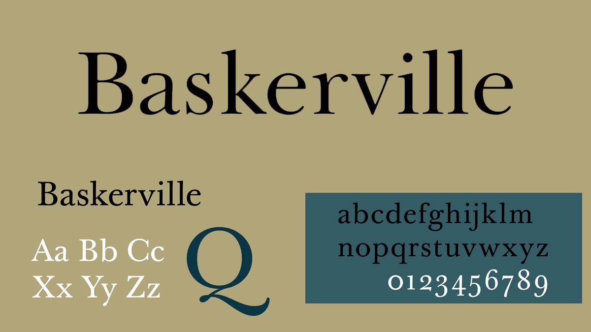
It is a typeface created in the 18th century by John Baskerville, and the font is named after him. A timeless classic, Baskerville is perfect for those who want an elegant and understated look. known for its readability and classic look, and it is often used in books and other printed materials
Garamond
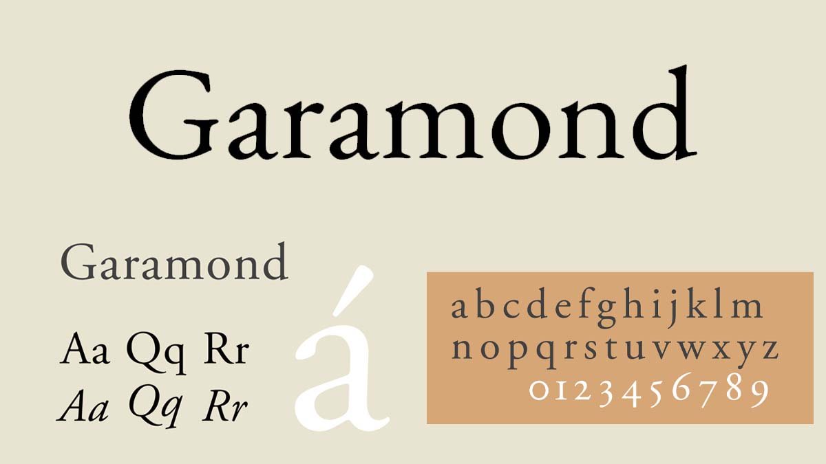
Garamond was one of the most famous typeface designers of the 1600s. It’s an effort to bring back the classic humanist fonts designed by Claude Garamont in the 16th century. Garamond is ideal for formal or traditional projects. Also, its elegant but simple design makes it a popular choice for body text and displays.
Bodoni
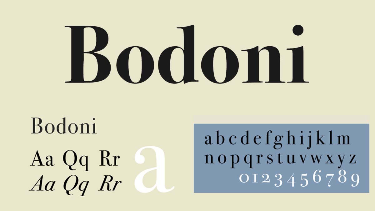
In the late 18th and early 19th century, Bodoni’s work had a considerable impact, and his typeface style became known as the “Bodoni face.” Its high contrast between thick and thin strokes still reads as refined and editorial, which is why fashion and luxury brands keep reaching for it.
Many different type foundries have changed and updated this classic serif typeface over the years. However, it remains a popular choice for designers looking for a timeless serif font.
Helvetica
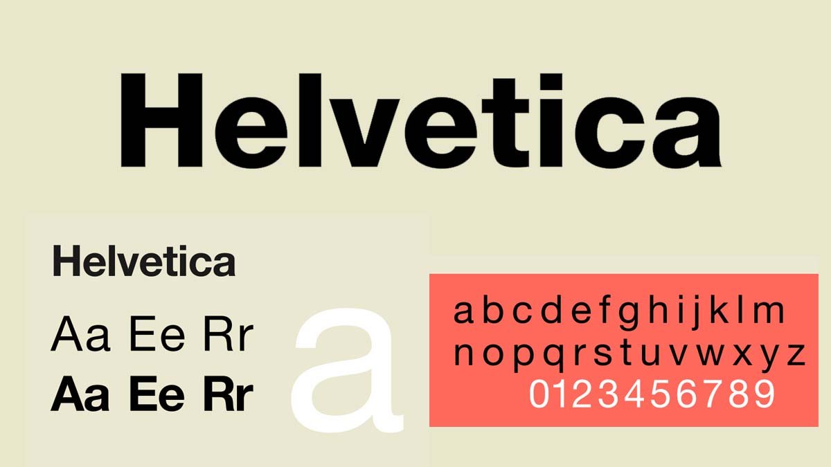
Helvetica has made a name for itself in web and interface design. Helvetica’s many weights and styles make it a flexible choice for both body copy and display. Owing to the same, the font is a popular choice for web and print design. Its clean, modern lines and neutral appearance make it easy to read. Helvetica was so famous that Gary Hustwit made a documentary about it.
DIN
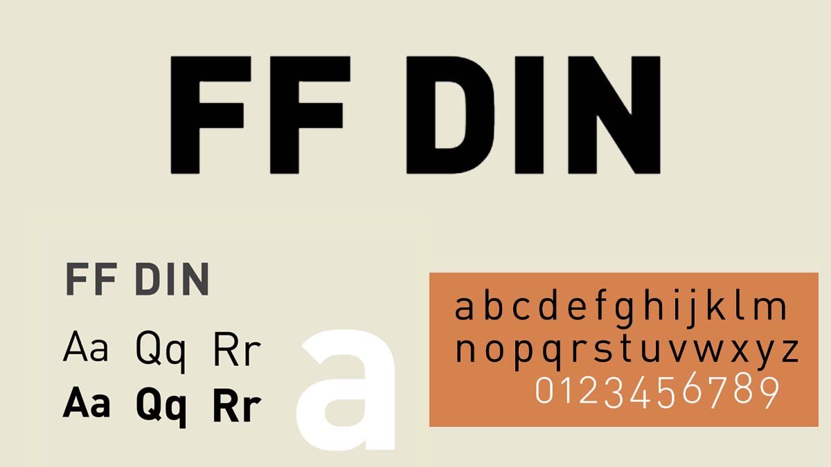
DIN is a playful font that will make your writing more interesting. It’s perfect for headlines, posters, and other creative projects. With its unusual curves and sharp angles, DIN will give your work some style. Give it a try today and watch how it changes the look of our content.
Futura
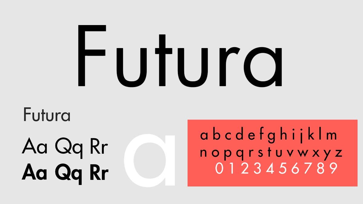
One of the most popular sans-serif fonts is Futura. Futura was the creation of German typeface designer Paul Renner in the 1920s, and he wanted it to be a revolutionary typeface that showed the modern age. A versatile and popular sans serif, Futura is perfect for various applications.
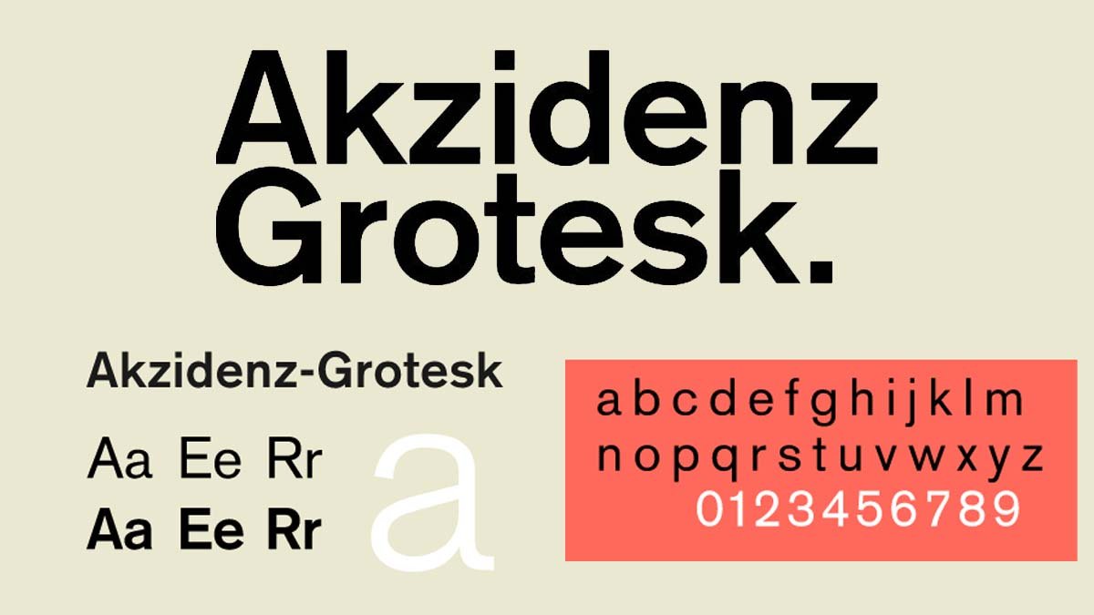
Akzidenz-Grotesk

Embrace Good UX and see a skyrocketing profit.
Talk to a UX expert
Clan Pro
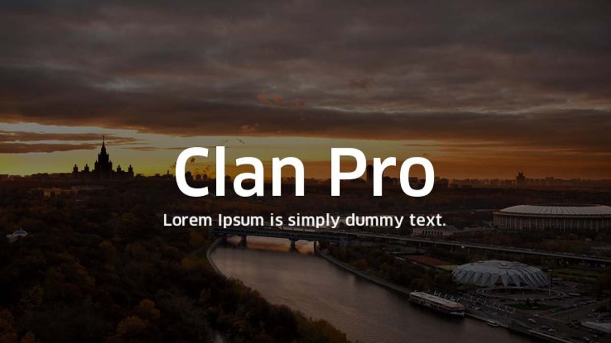
If you’ve ever wanted to stand out from the crowd with your font choice, Clan Pro is a great option. Developed by French typeface designer Neil Summerour, Clan Pro is a modern sans-serif font family. It includes several variations, such as Clan Pro Display and Clan Pro Narrative, so it can be adapted for different uses, whether you’re writing short captions or longer documents. Summerour took inspiration from traditional typesetting when creating Clan Pro, aiming to make it highly readable and exciting, and unique.
Rollgates Luxury
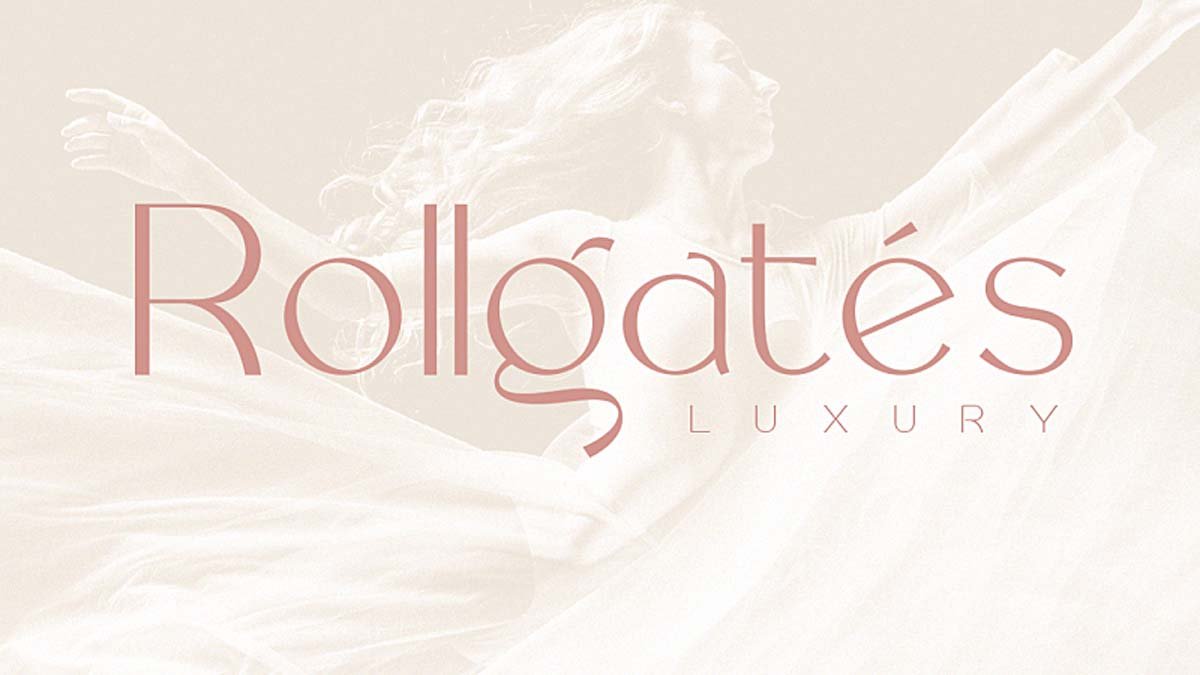
Rollgates Luxury is an elegant and expensive sans-serif typeface that works well for marketing materials, logos, and branding. Its sleek design makes it perfect for luxury brands, while its modern style ensures it will look great on any project.
Rollgates Luxury is created by Cotbada Studios and has multilingual support such as French, German, and Spanish.
Magnolia
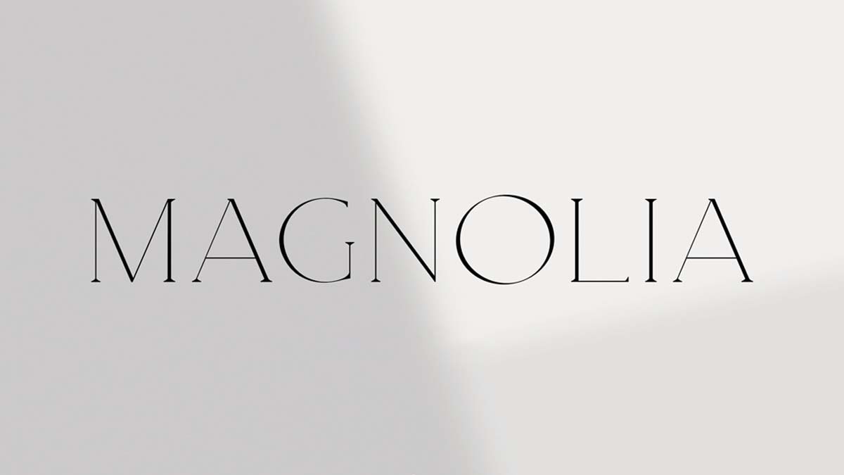
Elegant and timeless, the Magnolia font can make your design look luxurious. If your work calls for a dash of whimsicality, this is the font for you. From invitations to birthday cards, Magnolia will bring joy to your work.
The most expensive Fonts in the world!
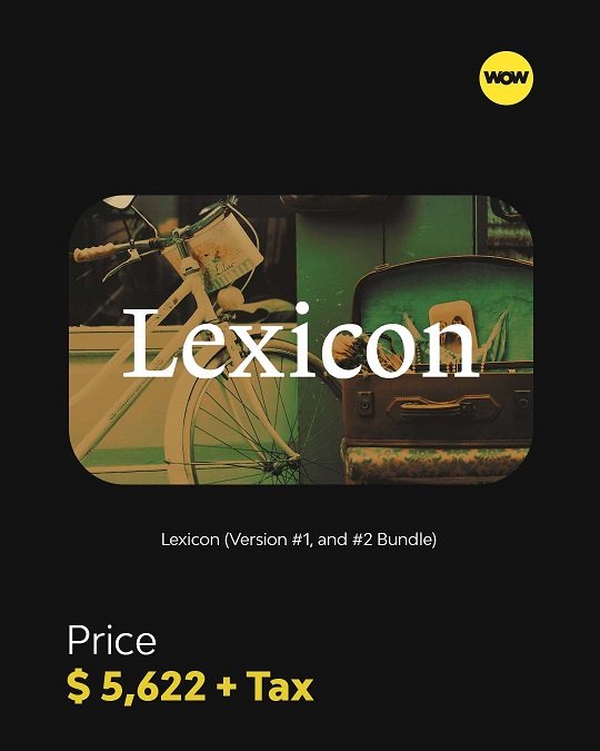
Lexicon
Trinite (Complete Family Bundle)
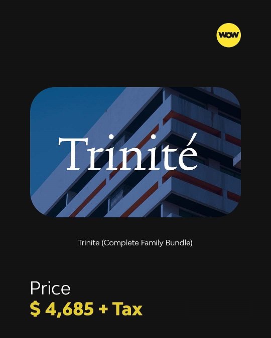
In 1982, Joh. Enschedé en Zonen(printing company) commissioned Bram de Does to create Trinité. The font was initially released just for photocomposition on the (now defunct) Autologic (analog) phototypesetting machine.s. It is a pervasive and complete font family differentiated by stem length. The short stem version (1) is best for body text, while the extended stem version (3) is ideal for headlines. All characters without ascenders or descenders are identical across all versions, making it easy to switch between weights and styles.
Ruse
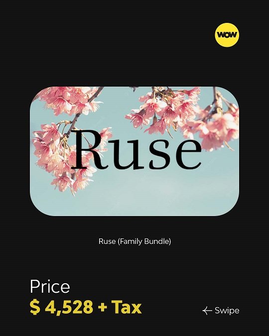
Astonishing in its breadth and depth, Ruse is comprehensive. The family has 11 distinct variations, rising in contrasting intensity from 000 to 100. Each style has a wide variety of ligatures and six different types of figures (hanging, lined, tabular, proportional, superior, and inferior).
Renard
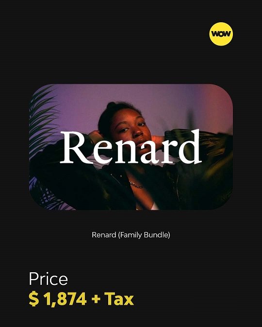
Renard, a font created by Fred Smeijers in 1992, is a beautiful example of his work. It was modeled after a 2-line Double Pica Roman cut by Flemish punchcutter Hendrik van den Keere in 1570 and published in Plantin’s folio specimen in 1585. There is no ‘bold’ weight available; however, there are two other options: Renard 2 and Renard 3.
Collis
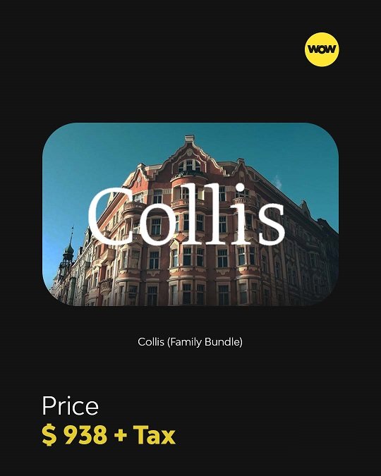
Collis is a typeface designed in 1993 by Christoph Noordzij. It is a typical The Hague-style typeface with a certain elegance and can be applied in small and display sizes on book covers and posters. The roman and italics contain an extensive array of unique characters, making it suited to complex typographic problem-solving. Collis can be used in a wide variety of applications.
Conclusion
Choosing the right font takes time, best practices, and, most importantly, time. But with the guidelines in mind, you should be able to find the perfect fit for your company. Ultimately, what matters is choosing a quality font that enables you to convey the right message to your target audience.
Frequently asked questions
What font is best for a luxury brand?
There’s no single answer, but most luxury brands land on a classic serif like Garamond, Bodoni, or Baskerville for the heritage and refinement it signals. Pair it with a restrained sans-serif for everyday text.
Are serif or sans-serif fonts better for luxury brands?
Serifs carry the premium associations most luxury brands want, which is why they dominate fashion and high-end branding. Sans-serifs work well as a supporting typeface for body copy and digital interfaces.
What are the most expensive luxury fonts?
Some of the most expensive commercially available typefaces include Lexicon and Trinité from The Enschedé Font Foundry; pricing changes by license and family size.
What fonts do fashion and luxury brands use?
High-contrast serifs like Didot and Bodoni for an editorial feel, and elegant transitional serifs like Garamond and Baskerville for timeless luxury.