
What is the importance of user-friendly error messages?
We have all experienced the frustration and annoyance of error messages on websites. “An error has occurred,” “Something went wrong?” etc.
Something has gone wrong. But just what went wrong? What occurred? What happened? What are we to do at this point? Not-so-helpful error messages that lack this information induce a sense of hopelessness.
User-friendly error messages are a vital part of any user experience but can also be a significant source of frustration.
It’s crucial to use error messages that are easy to read and clearly explain what went wrong to prevent users from becoming annoyed by errors.
In this blog post, we look at some guidelines that will help you through the process of designing user-friendly error messages.
What are Error Messages?
Error messages are one of the essential features of an interface. They need to be clear, concise, and informative.
The goal of an error message is to communicate the cause of an error and how to resolve it. They should avoid being overly technical or complicated.
For example, if a user enters invalid data into a form field (e.g., a credit card number entered in reverse), the error message should explain what went wrong and guide users on how to fix it.
What Makes a Bad Error Message?
A wrong error message can be identified by:
- Negative tone: Error messages written in a harsh, accusatory, or condescending manner.
- Blaming the user: Messages that make it appear that the user is responsible for the issue.
- Using technical terms: Errors that use jargon or too technical terminology instead of simple language.
- Inadequate information: Messages that lack sufficient detail to assist the user in resolving their issue. These error messages are often cryptic and confusing.
Which Would be the Best User Error Message?
The following attributes define an adequate error message:
- Provide background for what occurred.
- Explain why the error happened.
- Provide reassurance
- Give them a chance to remedy themselves.
- Give users a way out.
A good error message should provide a clear explanation of why the issue occurred, some background on what happened, and reassure the reader that the problem is not terrible and can be resolved.
It should also allow them to correct the issue themselves, if possible, or the option to receive assistance. Ensure to provide a way out of the error if users cannot fix it.
This helps create an engaging user experience, which is essential for a successful product.
Should Error Messages Say Please?
Error messages should be straightforward to understand to avoid further confusing or frustrating the user. Some may argue that error messages benefit from a friendly and helpful tone when they include a polite request like “Please,” but this is usually unnecessary.
However, if you include too many requests for politeness, the message may come across as less severe than it is. If users see the same format for error messages with a generic “Please,” they may learn to ignore them.
Error messages are more effective if they are direct and unpolished, drawing the user’s attention to the fact that there is a problem without sugarcoating it.
This, however, does not preclude the possibility of enhancing the semantic depth of errors. Use phrases like “We’re sorry, but we weren’t able to complete your action” or “Unfortunately, we couldn’t process your request” rather than just “The action could not be completed.”
This adds more information to help users understand what went wrong and why the action was unsuccessful. It makes the message sound more personable and sympathetic without detracting from the message’s primary purpose of informing users of an error.
How to Design User-Friendly Error Messages?/ Best Practices
Here are some guidelines to help you craft the most effective error messages for users. We have also included examples of bad and good error messages for your reference.
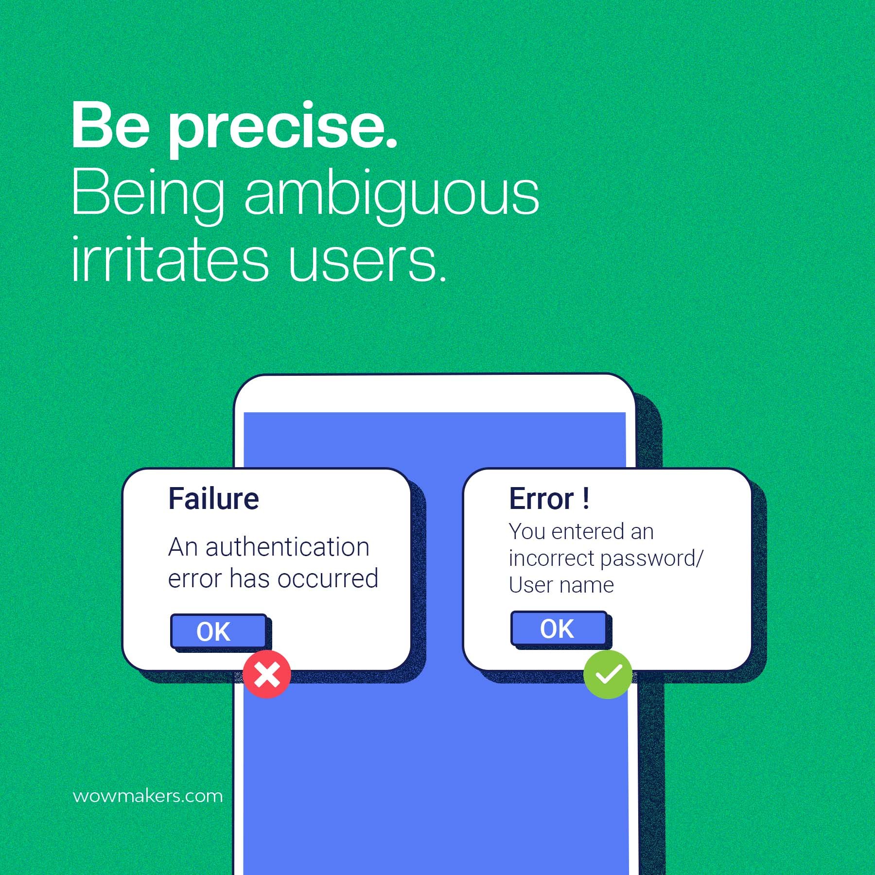
Being Precise
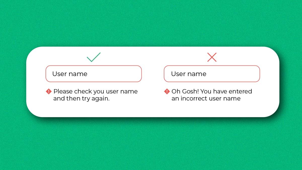
Error messages should be crafted with simple, easy-to-understand language that gets the point across without being too wordy. Avoid jargon or overly technical terms; use common words and phrases instead.
Make sure your error messages are specific so users can quickly identify where their mistake lies and what they need to do to fix it.
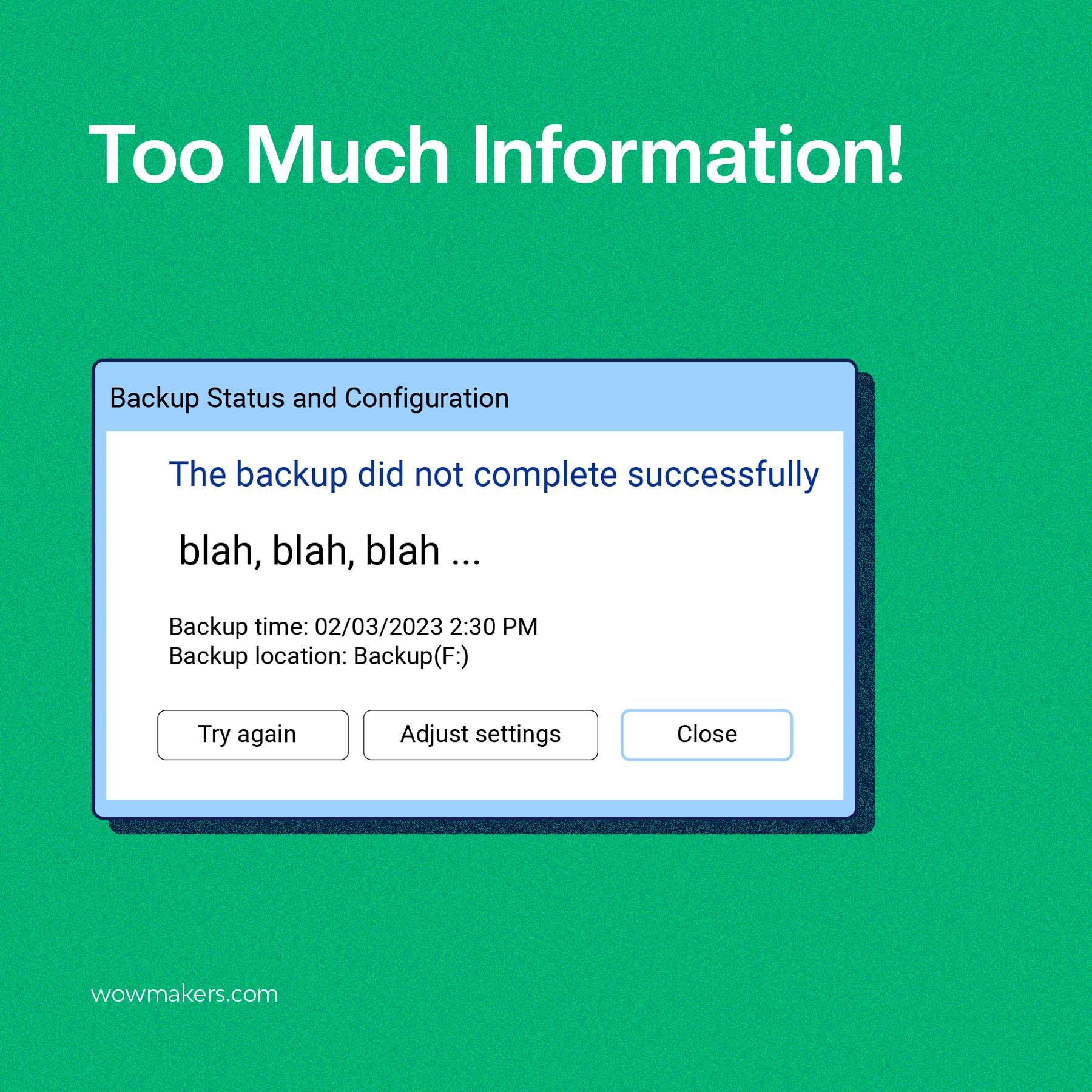
Don’t Say Too Much
Too much information can be overwhelming and make it hard for users to discern what action needs to be taken. Excessive details in an error message can overwhelm users and make it difficult for them to identify the issue and find a solution quickly.
Excessive details in an error message can overwhelm users and make it challenging to quickly identify the issue and find a solution.
Error messages containing too much information can be inaccurate or outdated, leading users to rely on false information when resolving problems. Keep your messages short, clear, and focused on providing a solution.
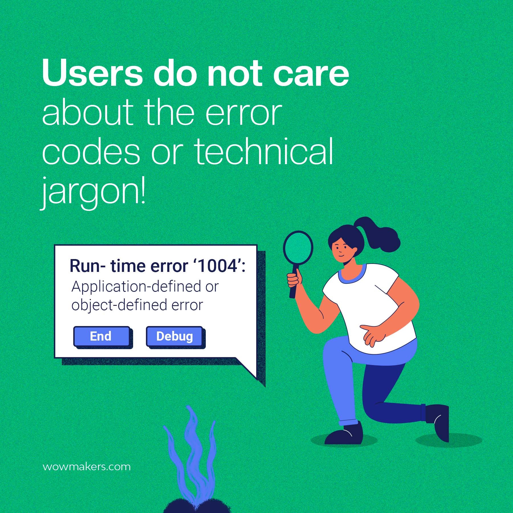
Avoid Technical Jargon
To make error messages more user-friendly and easy to understand, it’s best to avoid using technical jargon.
When users encounter an error message that contains technical terms or jargon they are unfamiliar with, it can be difficult for them to understand the problem and find a solution.
To help users quickly and easily fix any issues they may be having, error messages should use clear and understandable language.
Providing error messages that are both clear and concise, written in language that is easily understood by the intended audience, can significantly enhance the user experience and decrease frustration.
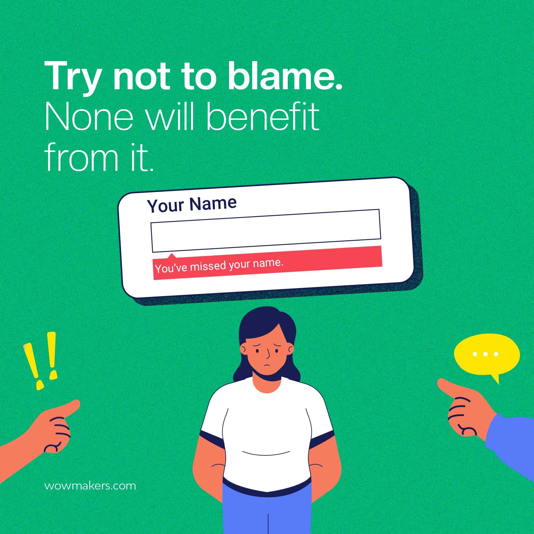
Avoid Blaming the Users
Error messages should never appear accusatory or blame the user—even if their mistake is apparent. Instead, concentrate on being helpful and informing them how to get back on track.
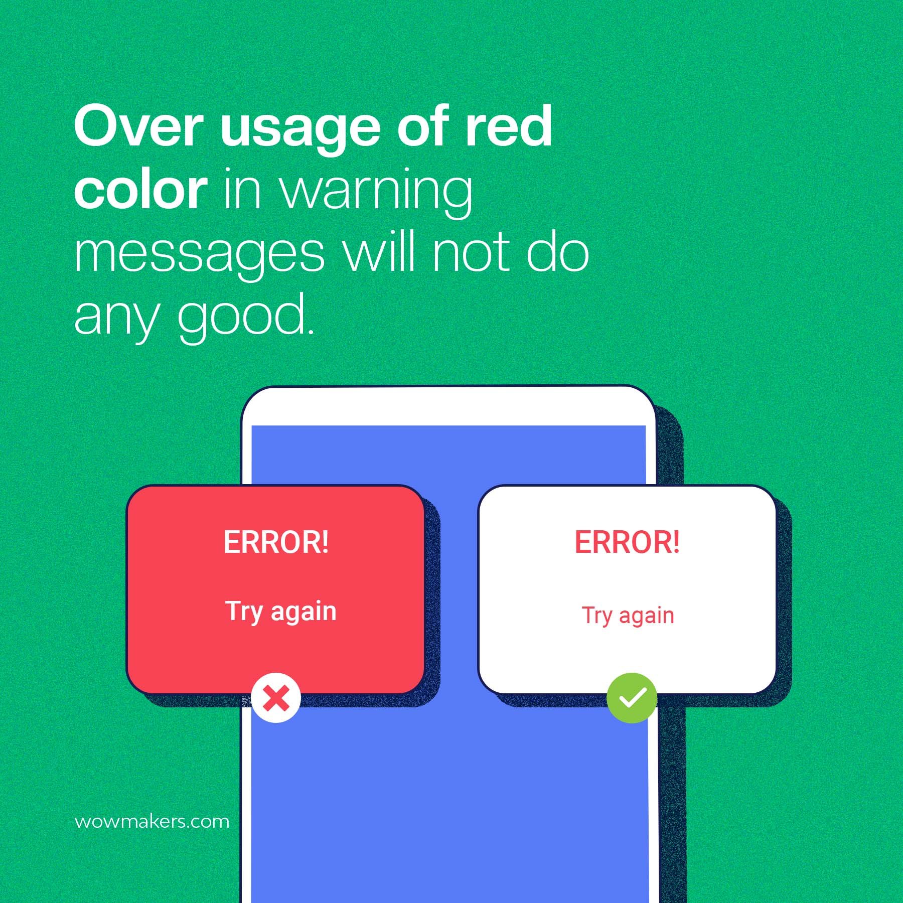
Avoid Excessive Use of Red
Red is often associated with critical errors and can evoke a sense of panic in users. It might make them more likely to abandon the process they are engaged in.
A simple, concise explanation of the error and an icon should be included to provide users with a clear understanding of what needs to be done.
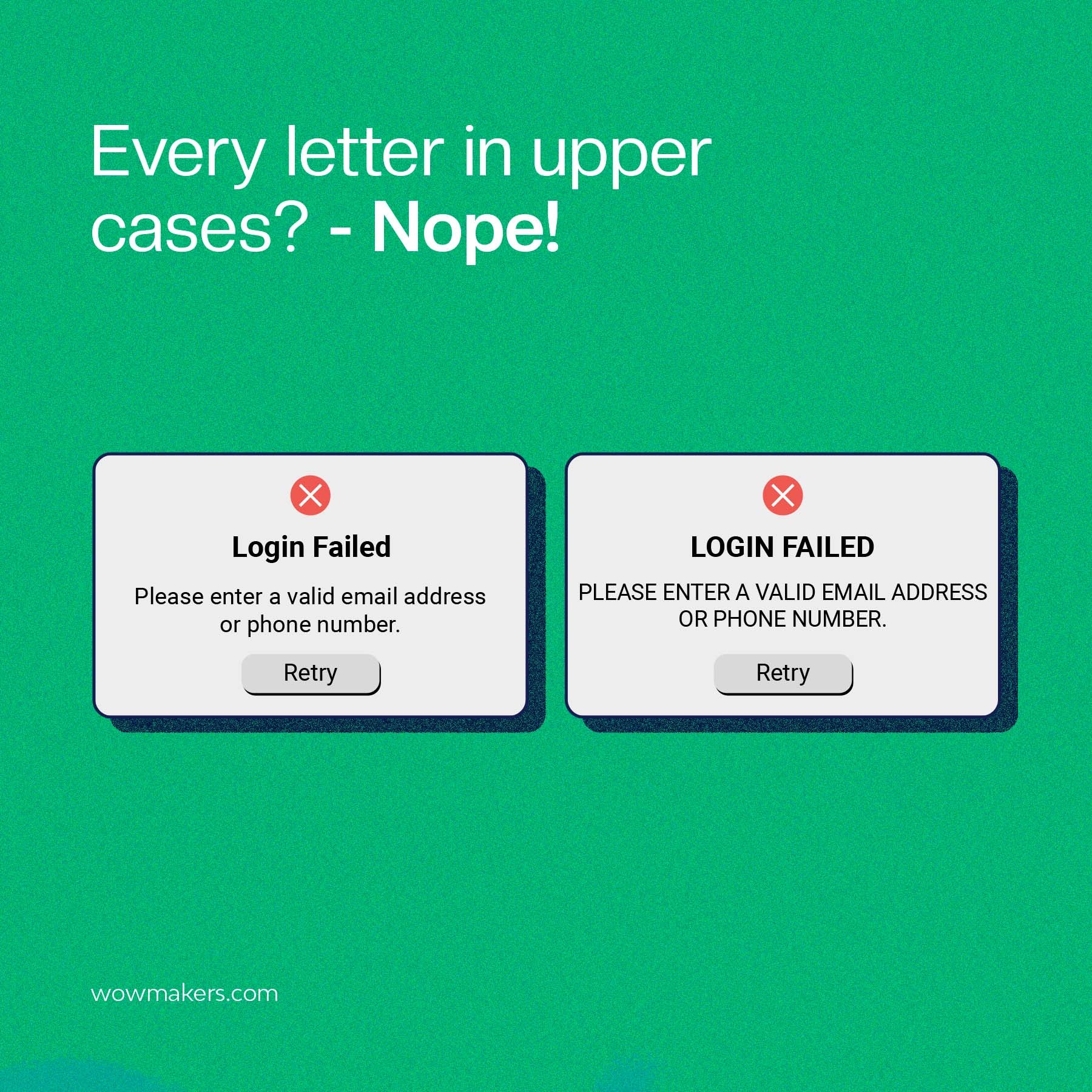
Avoid Writing in UPPER CASE
All-capital letters are more challenging to read than mixed-case text, making it more difficult for users to understand and resolve errors quickly.
Writing in all capital letters can appear aggressive or confrontational, resulting in a negative perception of the product or service being used.
All-capital-letter error messages lack professionalism and can reflect poorly on the brand or organization behind the product or service.
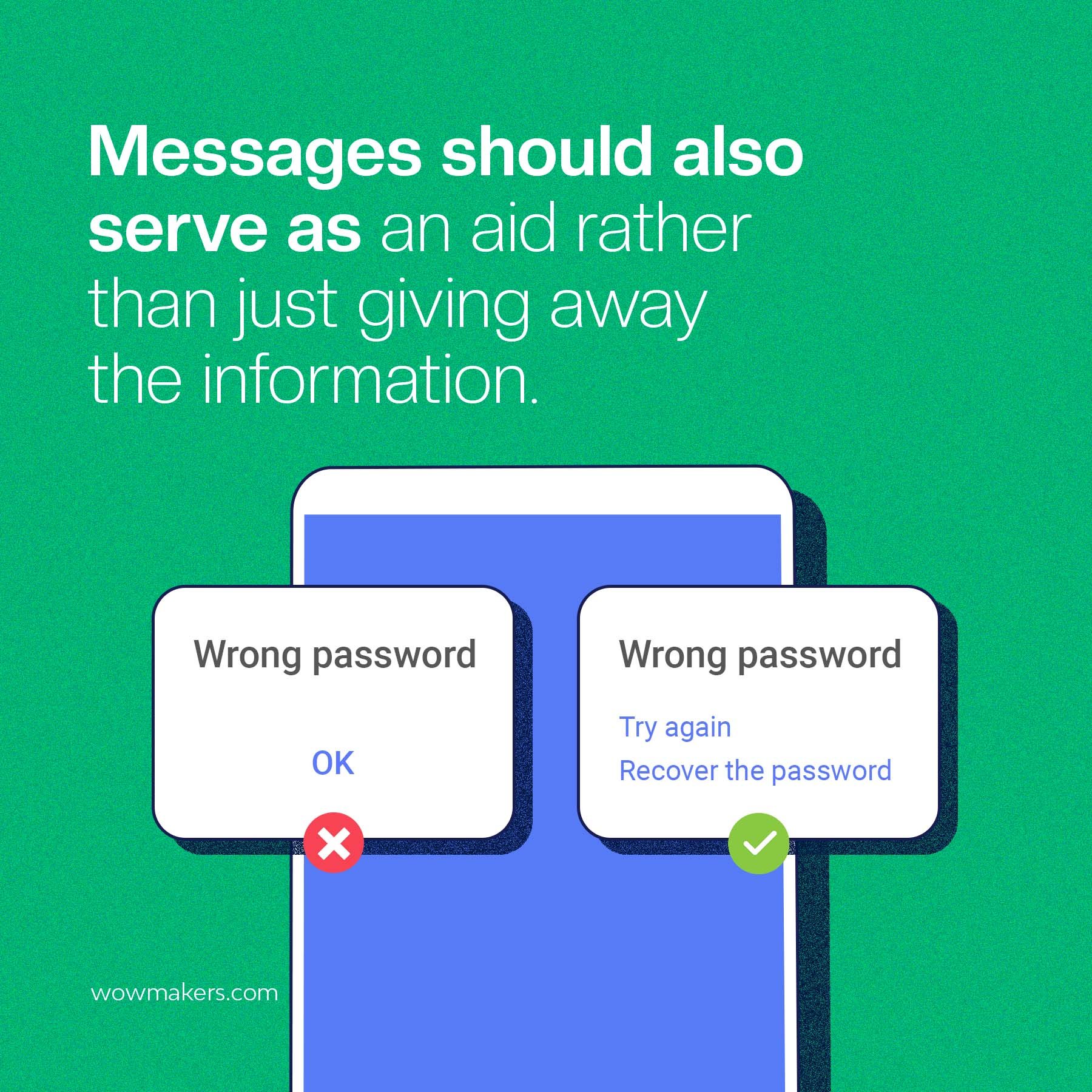
Give Users a Solution
Error messages should provide suggestions for how the user can overcome their challenge—otherwise, users will feel frustrated and confused. Error messages are intended to assist rather than provide information.
Restrict the Number of Error Messages Displayed to Users
Too many error messages can overwhelm users and prevent them from completing a task altogether. Think about ways to limit the frequency with which they appear, such as by displaying one error message at once or grouping related errors into a single notification.
Avoid Negative Language
Don’t use words like “failed,” “incorrect,” or “invalid” in your error messages. Instead, you should focus on a good outcome and use positive language to give users confidence that they can do the task.
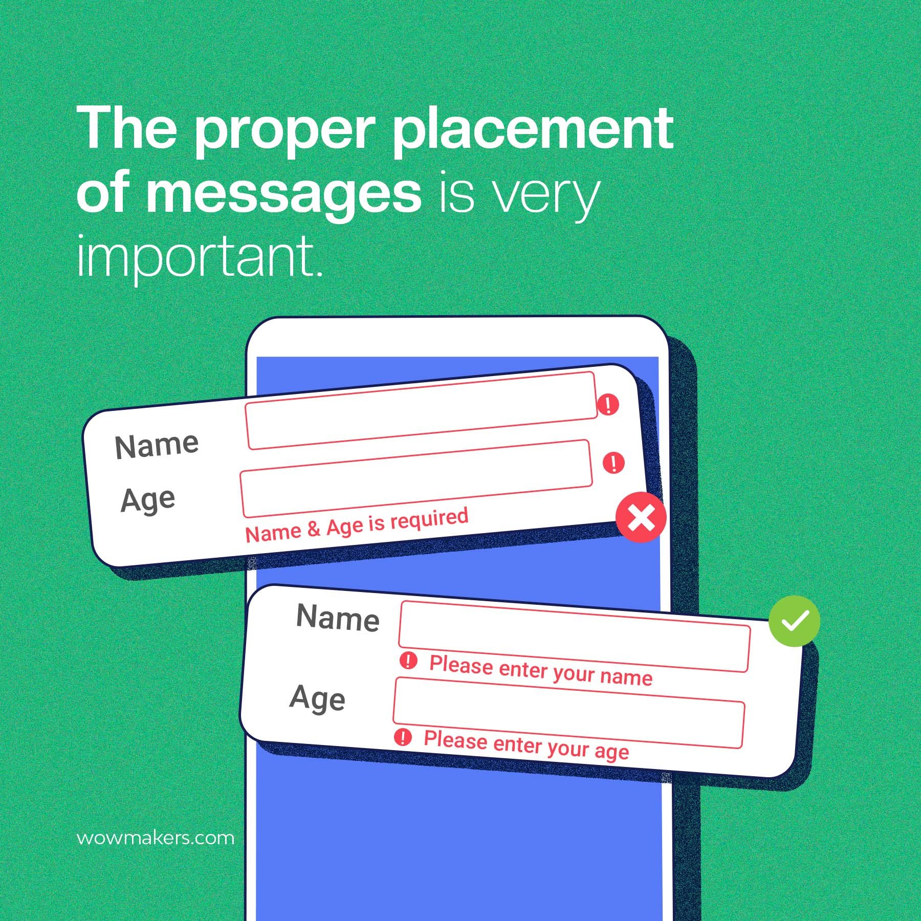
Proper Placement is Essential
Error messages should appear close to where the mistake was made, so users can quickly identify them and take corrective action as needed.
Additionally, error messages should be formatted appropriately to catch users’ attention when displayed.
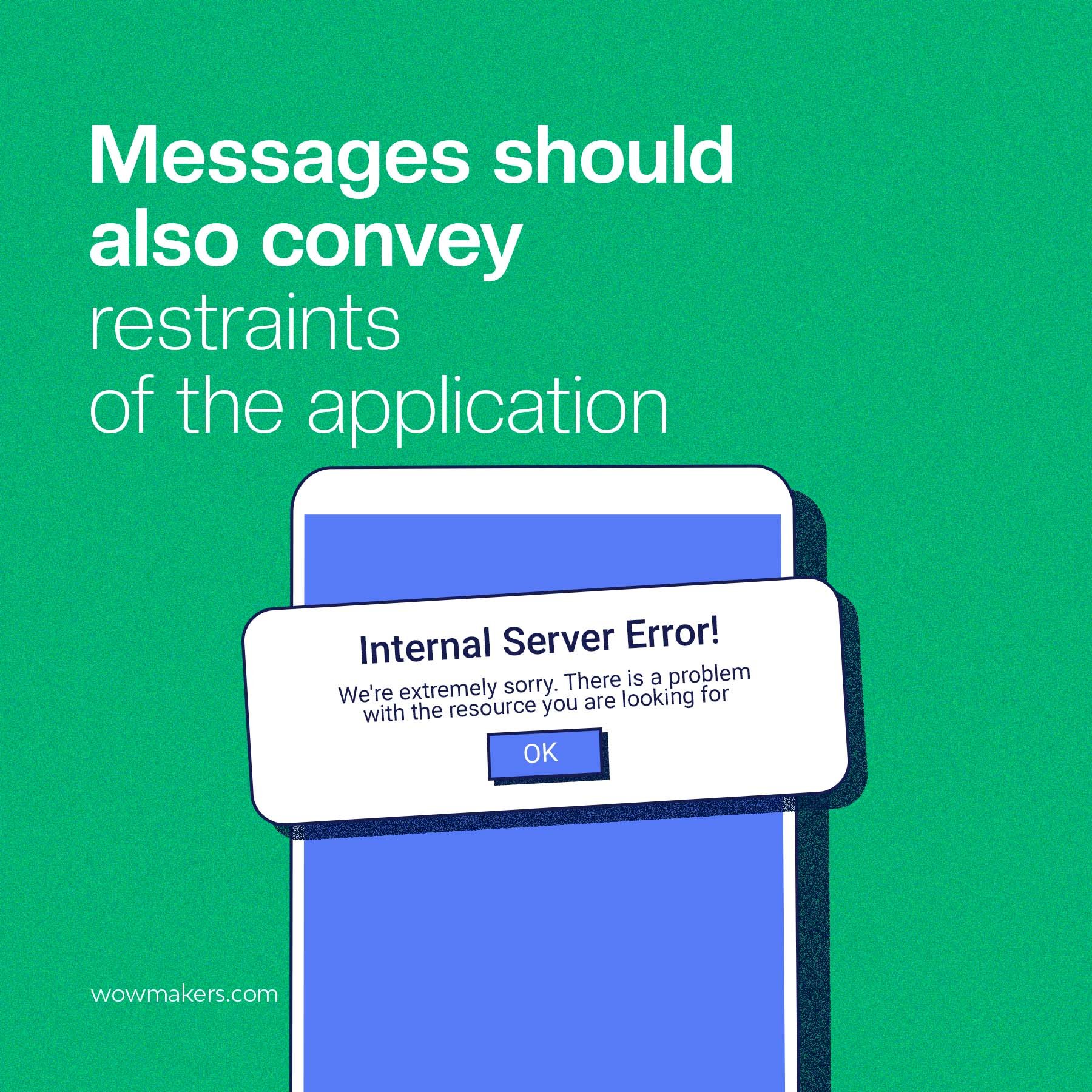
Restraints Should be Communicated
Error messages should be clear about the problem, including any limitations or restrictions limiting the user’s ability to complete a task.
Including limitations or restrictions in error messages assists users in understanding the context and reasons for the error, making it easier for them to resolve the issue or find a workaround.
Users unaware of restrictions or limitations may become frustrated when attempting to complete a task and encountering an error.
Providing clear information about these constraints in error messages can help prevent frustration and improve the user experience.
Key Takeaways
Flaws in the messages can cause user frustration, decrease user engagement, and even harm the brand.
So make sure that testing error messages are also a part of your test strategy to ensure that users have the best experience possible.
By taking the above steps, you can create user-friendly error messages that will help in keeping your users on track and engaged without any frustrations.
FAQs
What are the three different types of errors?
There are three distinct categories of communication breakdowns, and they are as follows:
Syntax Error
First, a syntax error occurs when the grammar or formatting of a message is incorrect, making it difficult to understand.
Typos, missing words, and improper capitalization are a few errors in written work. Messages containing syntax errors increase the likelihood of being misunderstood, which can spark interpersonal tensions.
Semantic Error
When the intended meaning of a message is lost in translation, a semantic error happens. Also, this type of error is widespread in idioms or informal language.
A semantic error can also be brought on by using words or phrases with more than one possible interpretation.
Semantic errors in messages are frustrating because they often necessitate further explanation from the sender before the recipient can grasp the intended meaning.
Pragmatic Error
Thirdly, a pragmatic error occurs when a message is sent but does not elicit the desired response from the recipient because its content is inappropriate for the given situation or context.
Since language and social norms vary significantly between cultures, misunderstandings of this kind frequently arise.
Moreover, pragmatic mistakes may occur when there are divergent points of view in a conversation or when one or both parties lack sufficient background knowledge.
If not corrected promptly, pragmatic errors can cause unnecessary friction between parties.
Which error message is better when users enter the wrong password?
The username and password entered did not match the credentials on record. Please double-check what you have entered and try again.