This is a comprehensive guide to UX Design for Email Marketing:
In this guide you’ll learn:
- UX principles for email marketing.
- Design system for email marketing.
- Design modules for email marketing.
- Best practices for a better user experience in email marketing.
- UX trends for email marketing in 2021.
In short, if you want to get more leads, signups, open rates, and click-through rates for your emails, this is the guide you need to read.
Let’s begin with understanding the context of email marketing.
The State of Email Marketing in 2021
Email is ranked as the most effective marketing channel. Period.
According to Smart Insights, it beats out social media marketing, SEO and affiliate marketing.
Based on the research by Statista, email marketing generates an ROI of $38 for every $1 investment.
You can calculate the approximate Email marketing ROI here
So it is safe to say that email marketing is here to stay.
What seems to be the problem then?
The Challenges of Email Marketing – Overall Experience
Do you have the habit of immediately reaching the ‘mark as spam’ button when you get an email that doesn’t connect with you?
This is exactly what is happening to most of the emails you’ve been shooting out to your target audience.
Yes, all those marketing campaigns and dollars ending up in the trash, quite literally!
Why?
“Email marketing is struggling with not enough personalization.”
To make matters worse, spam filters are now getting advanced with each passing day.
How can someone connect with the audience in such a short period of time?
It’s almost like asking how to impress your secret crush within 3 seconds of meeting him/her!
The answer to both these questions could be the same – by presenting yourself as interesting as possible to the other person!
It may sound simple, but it’s much more complicated in reality.
This is where the importance of a good UX design comes in.
UX Design in a Nutshell
What is UX?
Ever noticed how satisfying it has become for you to use a website?
Or an email or app that just produces a smooth interaction.
This is what the principle of User Experience (UX) is all about.
User experience focuses on improving the quality of the user’s interaction based on what they need.
The importance of UX design has been on a rise in recent times, with brands like Apple and Amazon inventing new ways to offer the best user experience.
They cater to a special type of UX – “UX so good so that it can drastically improve the revenue.”
Creation of a good UX design depends on a lot of user research, which involves detailed insight about what people read and want the most.
Curiosity, clarity of expression and empathy are some of the factors a UX designer looks into.
Let’s dig into why marketers need to give a damn about UX in emails.
Why UX Matters in Email Marketing?
Simply put, marketers do not pay attention to the effect UX can have on emails.
If you work in any of those SaaS companies,
or if you are a product manager at an ecommerce platform,
you would have thought about it at least once.
Designers slog for hours or even days to design an email that may not even work.
They do it because, in a target market of 269 billion emails, your ideal customer is rooting for you, waiting for you to make your move.
So how does an email stand out?
The same way the Empire State Building stands out – by being visually appealing.
How?
By offering one of the best views in not only New York but of the entire world!

Take note of the recurring word from here on, UX design.
Before we dig deeper into UX design for email marketing, let’s get the basics right.
The Basic Principles of UX Design
According to Hubspot, 59% of email users say marketing emails with better user experience influence purchase decisions.
How? With the effective use of UX principles.
This can improve open rates and provide a good user experience to the user.
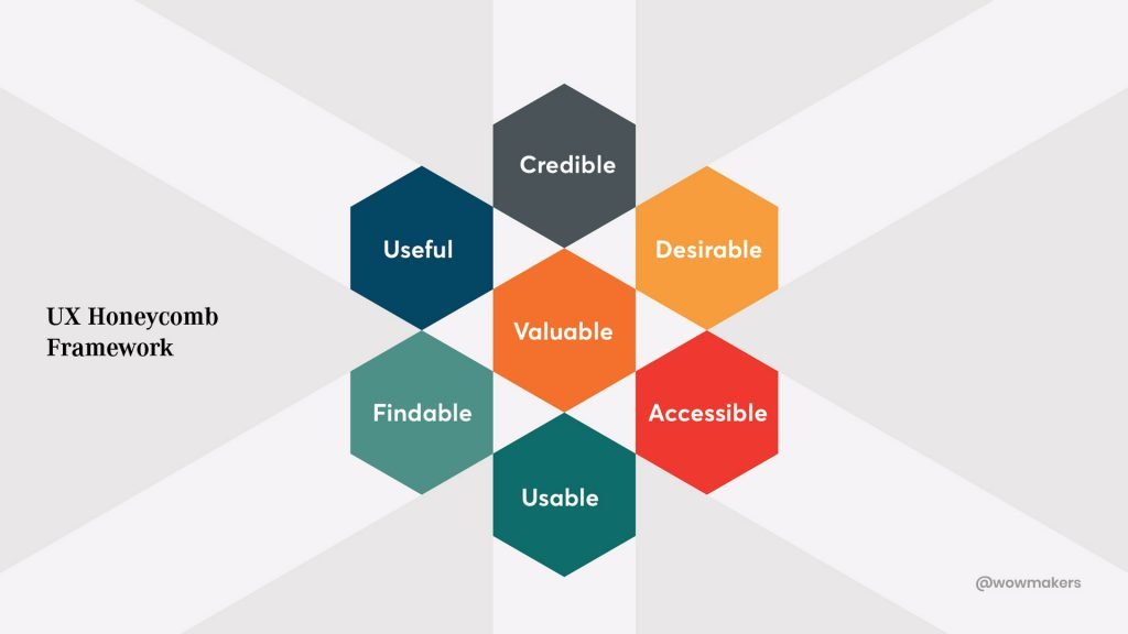
Here are the 7 UX principles or Peter Morville’s UX Honeycomb Framework that can help you create an effective email experience.
They are:
- Valuable
- Usable
- Findable
- Useful
- Credible
- Desirable
- Accessible
These principles have been constructed into chapters for your better understanding.
Here you’ll learn:
- Chapter 1: How to make your email designs valuable to the user.
- Chapter 2: How to improve the usability of email designs.
- Chapter 3: How to structure your email content to make it easily findable.
- Chapter 4: How to make your email designs useful.
- Chapter 5: How to improve the credibility of your email.
- Chapter 6: How to create desirability on a marketing email.
- Chapter 7: How to make your email design accessible.
Chapter 1: How to Provide Value to the Reader with the UX Design Approach?
A valuable email user experience is what makes the customer journey easier.
Why? It gives strength to your email campaigns.
And it will give the users what they want.
Let’s take a look at the steps to create value to email, by understanding the user intent and needs.
Tip #1: Gain Attention with a Relevant Subject Line
Crafting a relevant and important subject line is the start of your beautiful friendship with your reader.
Neil Patel is one of the few online marketers who consistently gain user attention through his emails.
Let’s look at an email from Neil.
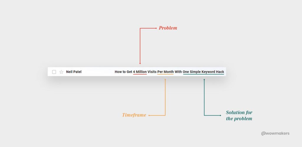
In the mail, the problem of low website visits is first brought into attention.
Their objective is to increase traffic.
This is where we empathize with the user.
Neil ends the subject line with a solution to generate curiosity:
“One simple keyword hack”
Startup entrepreneurs, small business owners, marketers and SEO strategists who are not getting visits are likely to open this mail.
Tip #2: Impress the User with Value-Driven Product Portfolio
Out of hundreds of emails reaching your customer’s inbox, a handful of them gives the reader its true value.
How do you define value?
Let’s take a look at a value-driven email from GoPro.
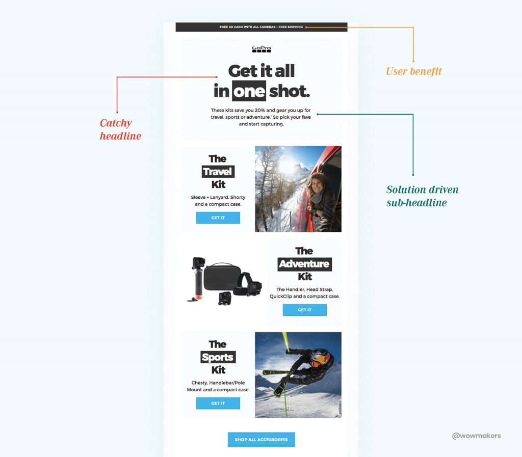
Benefits like “free shipping and free SD card on purchase” were placed above the headline for easy visibility.
Details about the offer has been included in the subject line which tempts the reader to scroll down.
In a single move, GoPro went on to showcase their products in 3 categories that a user can easily understand.
“The adventure Kit”, “The Sports Kit”, “The Travel Kit”
Along with the photos, they have also briefly mentioned what comes with each kit.
To top it all, CTA buttons have been given to each category of products making the way for an efficient email experience.
Takeaways:
- Creating curiosity and urgency in the subject line to hook the audience.
- Generate interest with value-driven content in an email.
Chapter 2: How to Improve the Usability of Email Using UX design
The usability of an email is defined by two questions.
- Is it usable for me?
- How can it be usable at this point of time?
The time at which the user receives the mail is also relevant
For example, a welcome mail is a perfect way to interact with the user and introduce the products.
Tip #1: Optimize the Headline to Put the Focus on the Message
Email should be kept short and sweet.
Headlines should be optimized in such a way to highlight the key takeaway.
Let’s take a look at how the fashion brand ‘’Hunter’’ worked on the usability factor.
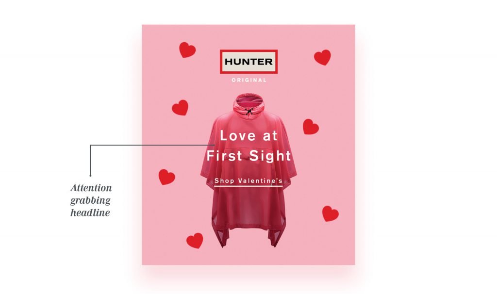
With a clear headline and message, the need to shop for their Valentine is stressed.
The reader is very familiar with the user experience here i.e click on the ‘Shop Valentine’ link, which ultimately takes the reader to Hunter’s website.
Tip #2 – Retain Customers with Zero Learning Curve
Readers should easily understand the core message of an email with ease.
The message should have a clear focus, but on top of that, it should also raise brand awareness.
Let’s take a look at Nike’s ‘Happy Birthday’ campaign.
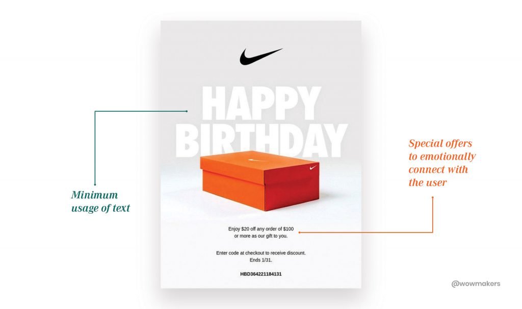
This helps in increasing brand loyalty.
How?
By giving a special discount on their birthday, capturing their emotional connection.
With minimum usage of text, they have successfully conveyed the message.
Takeaways:
- Focus on seamlessly delivering the core message.
- Reduce the learning curve of email layouts and designs so that the user can easily find what they want without any pain.
Chapter 3: How to Make Your Emails Findable Using UX Design?
The marketers should ask themselves:
“Can my readers find information easily?”
To make emails ‘findable’, one must know the importance of structure and navigation.
‘Findability’ is closely related to ‘Usability’ and ‘Accessibility’.
To make something easily findable, the design should be easily accessible and the content should be useful.
Tip #1- Responsive Navigation
Making your emails responsive is the first step to creating a findable email.
With an adept structure and navigation, a reader can easily find the information he is looking for, thus increasing the chances of that email to convert.
For this to work well, you do need to make use of email software that is able to do that and have a responsive email design-builder.
Let us take an example of how Google Assistant makes effortless navigation.
Here, users are given information about their favorite restaurants,
places they need to check out and the games they missed out.
-all by relying on the users’ history.
Tip #2- 3-Second Formula for Findability
Findability relies on navigation.
The ease at which a user can understand the text, icons and overall format.
How to know your email navigates well?
Implement a 3-second formula.
Conduct a test whether the user can analyze and read the content with ease within 3 seconds.
Let’s have a look at how JetBlue Airlines crafted their welcome email.
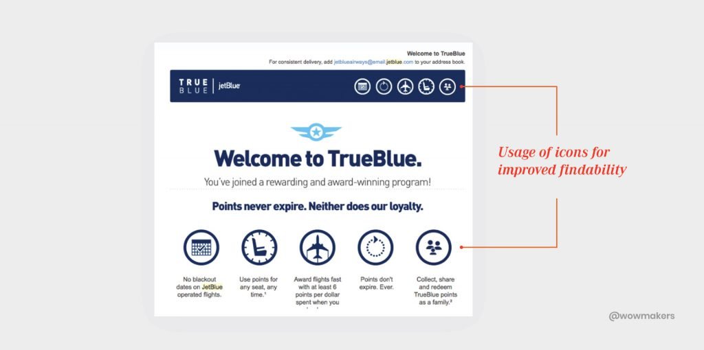
Loyalty systems are typical in their industry, so it makes sense to emphasize the perks out of the gate and the most out of your travel email marketing strategy.
Now this had to be conveyed to the user.
And what’s better than a welcome mail to begin with?
In this email, the reward system was introduced to the user with a simple sub-headline.
All the benefits of the point reward system was displayed in icons under the subject line for easy findability.
These icons were also placed in the header portion along with the program name – TrueBlue.
In one single mail, they welcomed their user, introduced their reward system and explained it with visual icons.
Takeaways:
- Use a 3-second formula in your email design. Your message should be easily readable and findable even if the user skims through the email.
- Optimize navigation and content in an organized pattern.
- The content should have an organized reading order.
- Looking into an email, the user should feel that all the information is only a click away with the limited time he has.
Chapter 4: How to Make Your Email Designs Useful For Users.
What makes an email design useful?
When the information in an email is worthy to the reader.
Tip #1- Content with Relevant Images Works the Best.
Images that can relate to human problems can easily capture attention.
According to a study by Zabisco, the human brain can process images 60,000 times faster than text.
Let’s take a look at a recent email from Zomato, a leading restaurant review and food delivery platform.
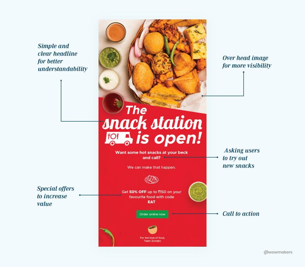
Zomato recently introduced snacks as their latest delivery option.
The purpose of this mail was to let customers know that they can order snacks from now on.
The email goes on to prove its usefulness, with the inclusion of a coupon code and CTA button.
Let’s conduct a quick analysis to figure out how useful this design is.
An attractive image of snacks that gets user attention? Check.
Inviting users to try out snacks? Check.
Coupon code for the user? Check.
Call to action? Check.
This email design, my friends, is useful.
Tip #2 – An Email Should be Time Relevant.
Wouldn’t it be awesome to receive an email that just reads your mind?
The kind that gives you the information you need, designed in a layout that is easily understood?
Readers prefer visibility and instant info over visuals with complicated designs.
On that note, let’s take a look at the email layout of Grammarly:
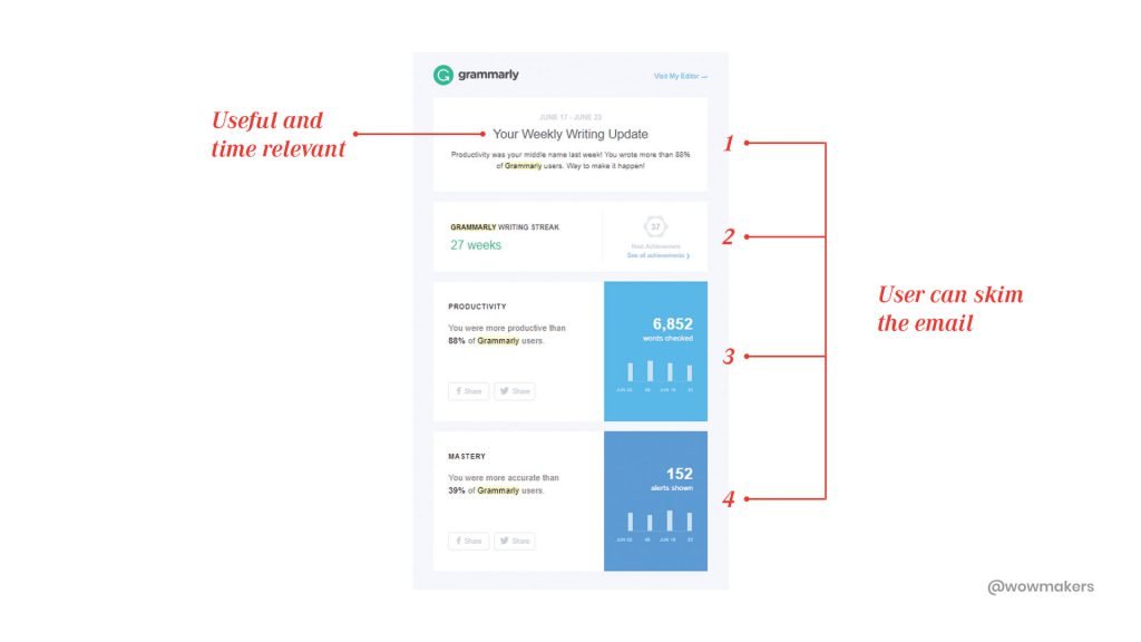
In this example, they reached out to the users with weekly updates.
The purpose of this mail was to showcase the different areas the user had worked on.
The mail was structured into 4 boxes which enables the user to have a quick glance.
It also included an analysis on user’s productivity and accuracy in a week.
In no time, user can read this mail, grab the relevant information and take insights from it.
The mail is personalized and is time-relevant.
Takeaways:
- In your email real estate, give priority to images over text, as they have 94% more views compared to the mails without images.
- An email layout should always be time relevant.
Learning good?
Let’s move on to chapter 5.
Chapter 5: How to Improve the Credibility of Email With UX Principles?
Do you remember those emails that instantly connected with you?
All those emails had two things in common. Trust and effort.
The audience will now pay attention to your content and your messages because of the credibility you put forth.
Tip #1 ��– Personalize for Credibility
Using a person’s name or personalized information can do a ton of good for an email.
It is a reaffirmation to the reader that email marketers go to great lengths for communication.
Let’s check out an email layout mostly used by ecommerce brands.
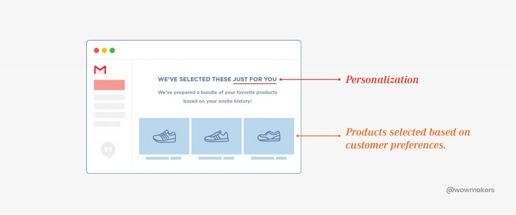
Don’t we all love that?
Tip #2 – Segmentation for Credibility
Most of the companies blasts email to everyone, with no segmentation.
Segmentation, however, will help users connect with the brand.
Messages are now tailor-made keeping in mind the different target groups a business caters to.
Readers will grow to respect these brands for the amount of homework they do.
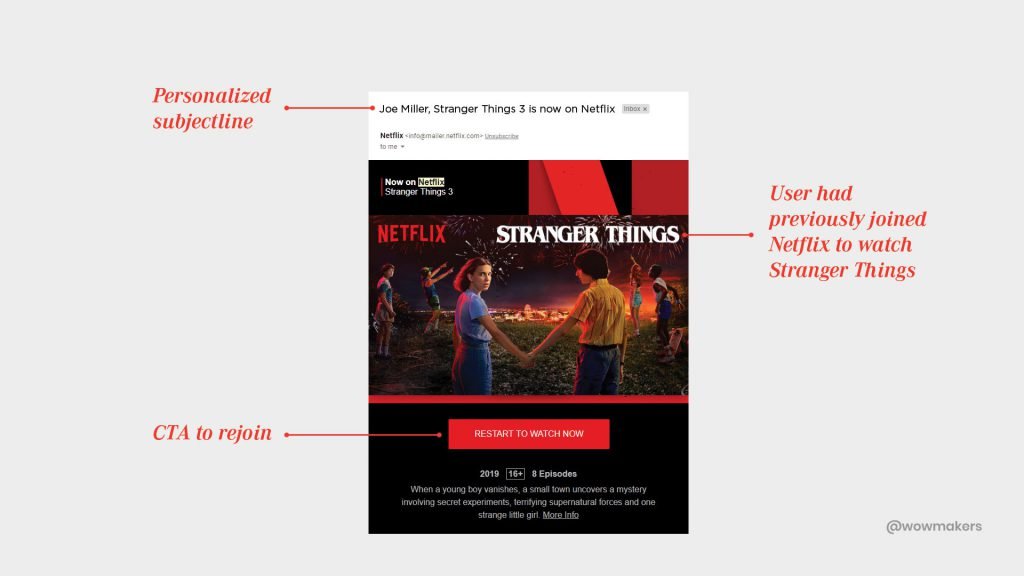
They knew segmentation was the key to rekindle their relationship with their unsubscribed viewers.
In this case, Netflix focused on the viewers of its hit series, Stranger things.
To put it simply, segmentation is all about using customer data and buyer behavior to create profiles of users that can be later used for email marketing.
Takeaways:
- Personalizing information based on customer preferences will enhance the credibility of an email.
- Segmenting users based on their data can be used to create user profiles, which will help in better segmentation the next time the need arises.
Chapter 6: How to Create Desirability on a Marketing Email with the UX design Approach?
Here, the idea is to make your email desirable by creating a hook that addresses the discomfort and frustration of a customer.
How to make the mail desirable?
By tweaking email content with solutions to pain points.
Tip #1 – Minimal Design for Desirability
Images and animations work a ton of good.
A minimal design? Even better.
The content becomes desirable when it instantly appeals to the eye.
Let’s take the example of Dropbox.
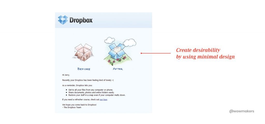
With just a “before and after” depiction of how your files can be stored,
Dropbox communicates its USP with a minimally designed email.
In this mail, content is crafted well and placed with a clear CTA.
Minimal design helps the reader see that clearly and faster.
Tip #2 – Creating Desire by Touching the Pain Points.
An email has to provide a strong solution by touching all their pain points.
How?
Let’s find out with the example of Apple.
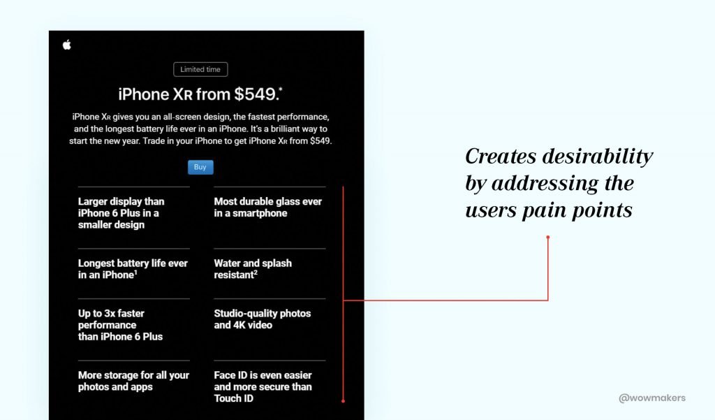
Under this campaign, an iPhone user can now exchange his device for the new and improved iPhone XR.
With this email, features like larger display, durable glass, battery life, water resistance, faster processor, 4K video, Face ID were brought to the attention of the iPhone users.
These were the pain points that the latest iPhone XR can solve.
In doing so, they created a strong desire for the readers to purchase the product.
Takeaways:
- The design should be up to the point and minimal. Aesthetics should be simple enough to carry the user to CTA button.
- Identify the users’ pain points and address them with your solutions.
Up to speed?
Let’s dive into Chapter 7.
Chapter 7: How to Make Your Email Design More Accessible with UX Design Strategy
How do you define accessibility?
How about, simple changes in your email design, that removes the barriers to readers with disabilities?
With an accessible email design, anyone can understand the message regardless of the device they use or the disability they have.
To be accessible, an email should optimize elements like reading order, text sizes, contrast between text and background colors.
Tip #1 – Maintain a Logical Reading Order.
What is a logical reading order?
People generally read/scan from left to right, from the title, the first heading, to the picture, then to the list of items.
In general, readers go from left to right before going to the next line.
This is the order in which a reader reads.
A reader can scroll through the many topics and go to the one they would like to visit, directly from the email.
This reduces the need to go to the website and browse through the topics.
Tip #2 – Email Layout Should be Compatible on Any Device.
The percentage of users reading your messages on mobile phones and tablets are ever-growing.
In a study by Litmus, mobile opens accounted for all 46% of email opens.
This is why an email should be responsive because you don’t want to miss out on people using different devices.
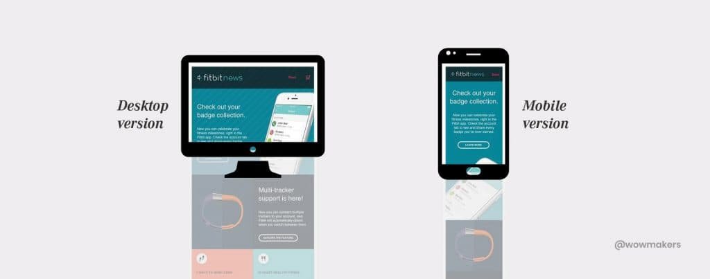
Let’s have a look at the example of Fitbit for your better understanding.
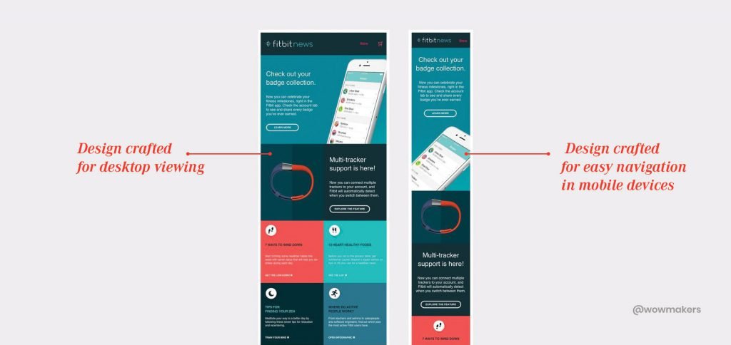
Their email follows a responsive design in both cases.
In this email, all the latest features about Fitbit are shown, CTA is placed well and the reader can access the entire information in a single scroll.
Takeaways:
- Always maintain a logical reading order.
- Follow an email layout that is compatible with mobiles, tablets and desktops.
Under the topic of UX principles, you have now learned:
- UX Honeycomb principles.
- How to implement the UX principles into your email design.
However, the mere knowledge of UX design principles is not enough to create emails with a good user experience.
There are design templates to help you create emails as per the best practices you’ve read above.
This brings us to the foundation of the design system.
Why Do You Need a Design System?
- You can eliminate the need to design an email from scratch if you have a proven format.
- Effectively tackle the scalability issue. The number of emails that you send today vs a month or a year ago is always on the rise.
An email design that stays in line with your growth goal is the new norm.
- Consistency is key, a subscriber should always know that the email is coming from you.
According to Fast Company, design-led companies enjoy a 32% more revenue and 56% higher total returns.
- Save time on tasks.
For example, in research by Litmus, they found out that design and coding are the two main time-consuming tasks while creating an email.
With an effective design system, your efficiency multiplies, thus helping you saving time on tasks.
You are not anymore dependant on the designers or developers who’re always ‘busy with important work’.
This is why the design system is very relevant in today’s world.
On that note let’s dive into the workings of a design system.
Introduction to Design System for Email
What makes an email tick?
Is there a format that we can follow that will guarantee good ROI?
Be it ecommerce giants, automobile brands or start-ups, managing email marketing can be a handful due to the growing scale of business.
And guess what, even these giants require a design system to keep producing good user experiences.
What is a Design System?
By definition, it is a collection of reusable components, guided by standards that can be assembled together to build any number of applications/emails.
In this guide you’ll learn about the different components of a design system:
- Color Palette
- Brand Guidelines
- The Standard Layout of a Design System
- CTA & Bulletproof Buttons
- Use of Fonts
Let me assure you that by implementing a design system, you are on the way to make your email marketing 10x effective.
This is what Ted Goas, a senior product designer at Stack Overflow, one of the largest, most trusted online community of developers had to say about design system.
“Since launching our design system, I’ve seen folks with little email experience building some pretty nice emails on their own” – Ted Goas
Let’s explore the elements of a design system in email.
Color Palette – How to Choose a Color Palette for Your Design System?
The psychology of colors plays a key role in the visual experience of an email.
85% of consumers identify color as the main reason why they decide to buy a product.
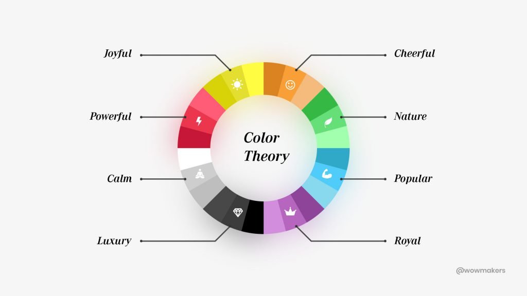
Let us explore the many color schemes that are doing the rounds.
AchromaticMonochromaticAnalogousComplementary
Achromatic Colors
This color scheme denotes the usage of only black and white.
Using white text over a black background or vice versa is the fundamental principle behind using the achromatic color scheme.
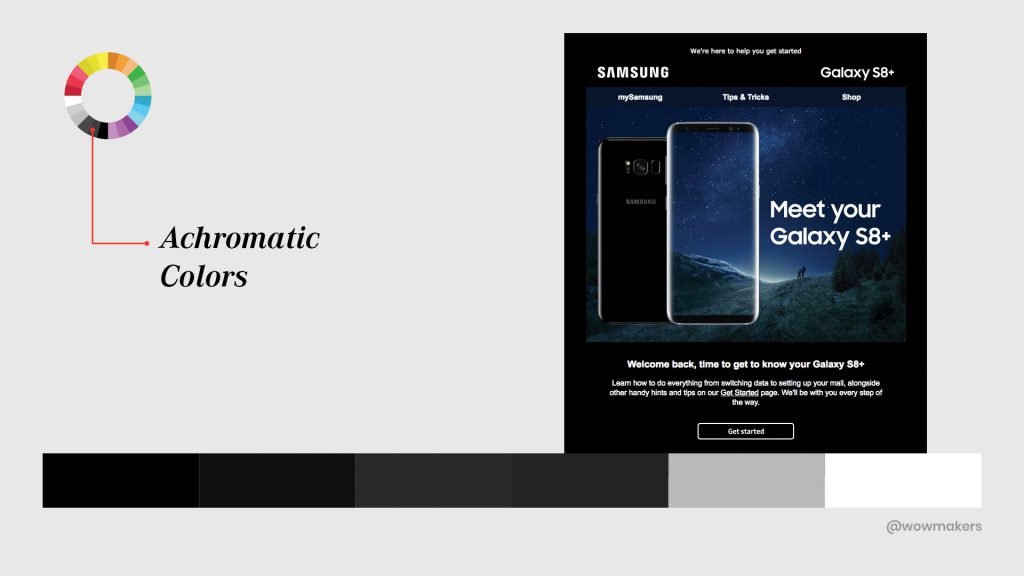
However, most of the real estate in this example email is in black and white.
Monochromatic Colors
As the name suggests, this color scheme mainly sticks to one hue and several variations of it.
The idea is to give the email a polished appearance.
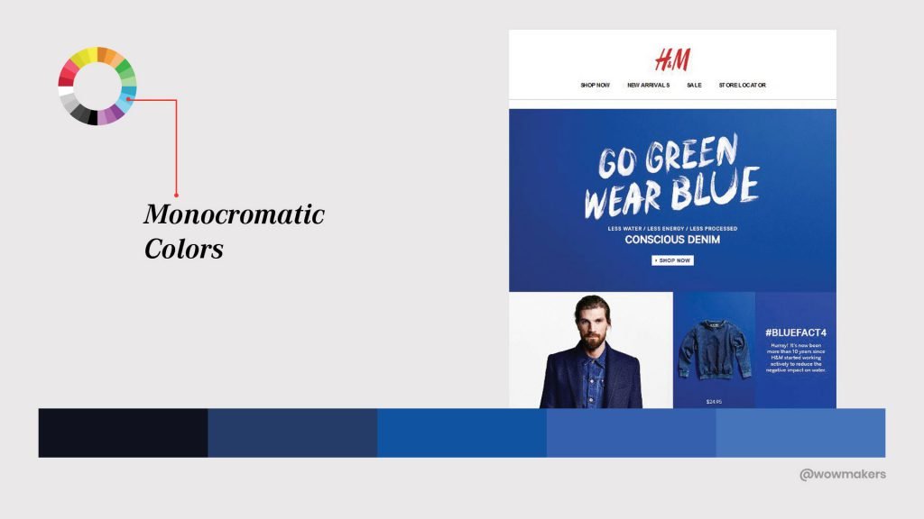
Like the brand itself, the email design looks sleek and clean.
Extra marks to them for choosing blue that denotes trust, confidence and cool emotions, which is exactly what you get when you own an H&M product.
Analogous Colors
Easiest to find in the color wheel, colors in this colors scheme are next to each other.
The closest example would be a common sight in nature, occurring in plants.
Since they are similar, they do not contrast each other creating a harmonious experience.
Let’s take a look at an example from Code School.
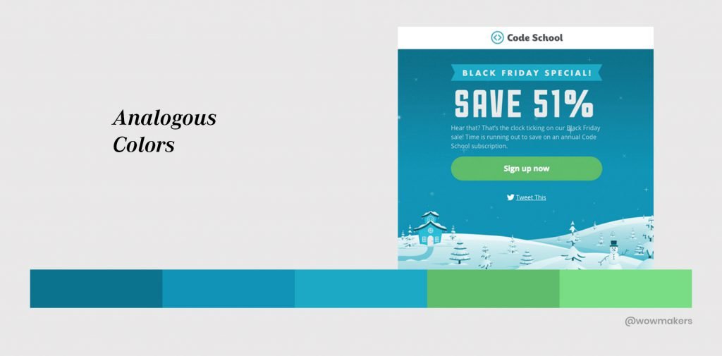
Here, Code School has gone with blue as their dominant color and green as the secondary color for CTA.
The colors don’t look contrasting and yet looks attention-seeking.
Complementary Colors
In this color scheme, colors opposite to each other in the color wheel are chosen.
Complementary colors are often used when you want something to stand out.
This, in turn, gives a contrasting and powerful appearance to the email.
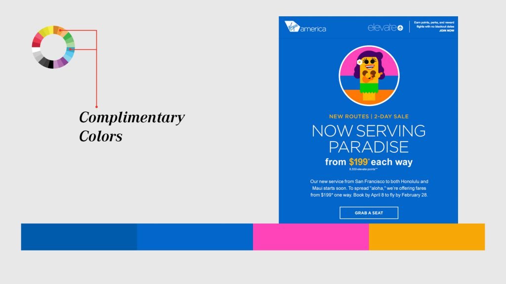
As part of their digital rebranding project, Virgin America did its best to gain the attention of its audience by adopting complementary colors in its message.
Up to speed with color schemes?
Let’s explore some of the color tips that will enhance your email performance.
Tips for using colors in Email Designing
Tip #1- Apply the 60-30-10 rule of color proportion.
As per this rule, an effective email design uses its colors in the following ratio:
60% for background color and overall design, 30% for headlines and subheadlines, and 10% for CTA buttons.
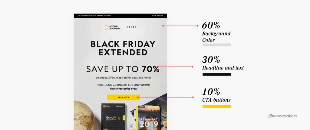
It is important to note that, the general idea is to make an email readable, so always stick to three colors or below.
Tip #2 – Use the Company’s Corporate Colors and Stick to Brand Guidelines
Choosing colors can be tricky, if you are losing time and effort on selecting the right palette.
One easy way to go about this, is to use the company’s corporate colors so that the email can also stay in line with the brand identity.
Here is an example of ‘sticking with the brand color.’
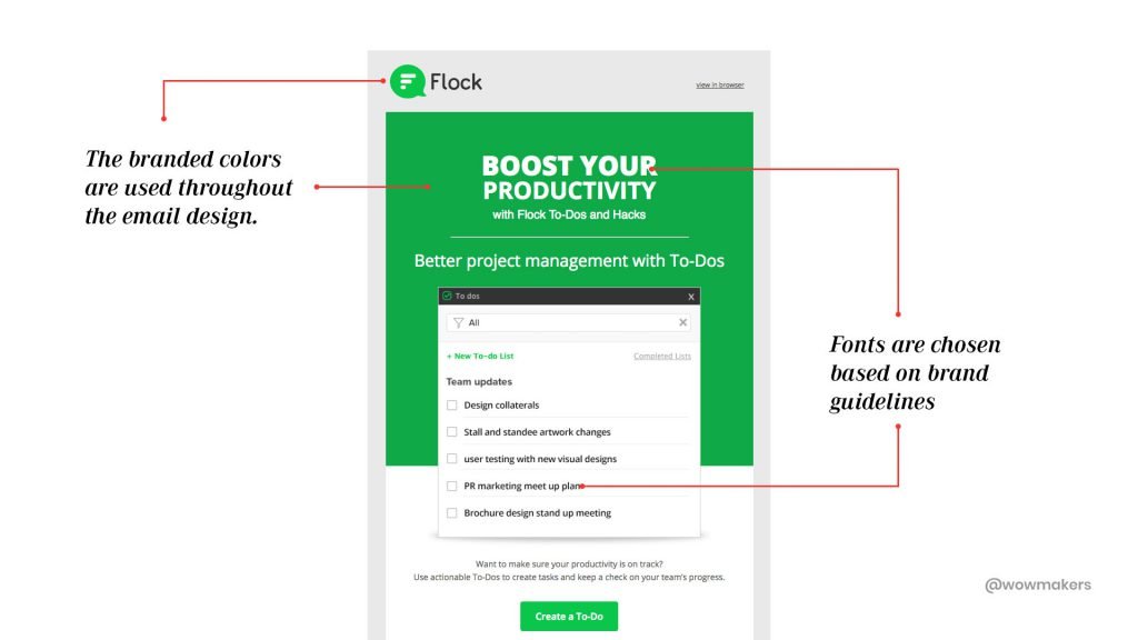
Safe to say, the reader here, actually gets an extension of the website or the app through the mail.
Tip #3 – Use a Contrasting Color for the CTA Button to Make It Stand Out
The text and the color filled within should be contrasting.
Here are the types of colors that fit well for the CTA button.
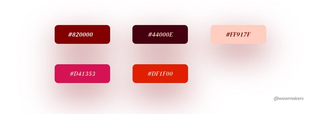
As it has an element of urgency. How so?
The debate of CTA colors has long been an industry favorite and Hubspot decided to do something about it.
They designed two posts that had different CTA colors.
This was done to analyze which color performed well, and to find out if there is a need for any debate.
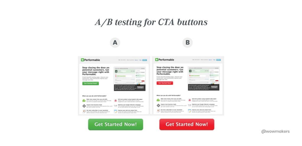
the Red CTA button outperformed the green one by 21%.
Clearly, the use of red traffic signals hasn’t stopped people.
Tip #4 – Be Aware of the Latest Color Trends
For example, using the Pantone color of the year 2019, Living Coral, in one of your designs can give your email design that coloring edge you have always missed.

you can check out, 6 tips on choosing a color by Alina Arhipova.
You can also use the Color scheme designer for finding the best color combination for your email designs.
4 Trending Color Tools That Every UX Designer Should KnowAdobe ColorColor HuntCoolors.coPaletton
These lessons and tools that you have learned here will surely help you while creating a design system.
Let’s move on to brand guidelines now.
Your emails are an extension of your brand and the need to integrate brand guidelines take roots here.
This practice will improve the trust and credibility of your organization,
which results in better click-through-rates.
Brand Guidelines – How to Integrate Brand Guidelines to Your Design System
What is a brand guideline?
They are the brand book, guide or rules that clearly define how your brand works.
It includes basic information like brand vision, history, mission, brand personality, color palette, design layout, copywriting style and more.
Focusing on brand guidelines can also help in effective marketing activities.
In short, all the clear-cut rules on how your logo, colors, and design elements conform to a brand guideline
These guidelines aid the creation of responsive images, consistent design elements, similar fonts, logo sizes and the placement of CTAs.
Brand Tone and Archetype.
Under this topic, you will learn how to integrate a brand’s tone into an email’s message.
All the successful brands incorporate their brand tone into their email messages.
What is brand tone?
It is the personality and emotion infused into the communication of a company.
The words, images and the type of content that is published, determine a brand’s tone.
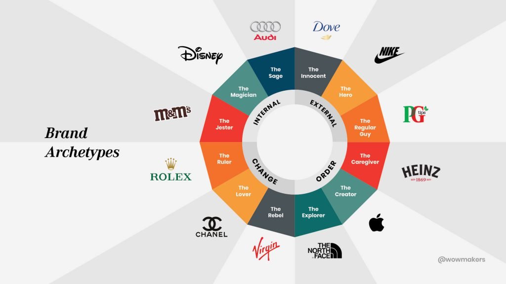
For starters, figuring out the brand archetypes can determine the personality of a brand.
What are brand archetypes?
Archetypes are the genre you assign to a brand, based on its characteristics, identity and overall value, making a brand easier to identify.
Or you could ask a simple question like,
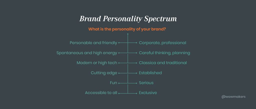
What is the personality of this brand?
Introducing the Brand Personality Spectrum.
Tip #1- Be Extremely Careful While Choosing the Words of Your Message
The words you put in your message determines a brand’s overall character.
These words should be an exact match to the brand’s personality.
Let’s look at an email from Casper.
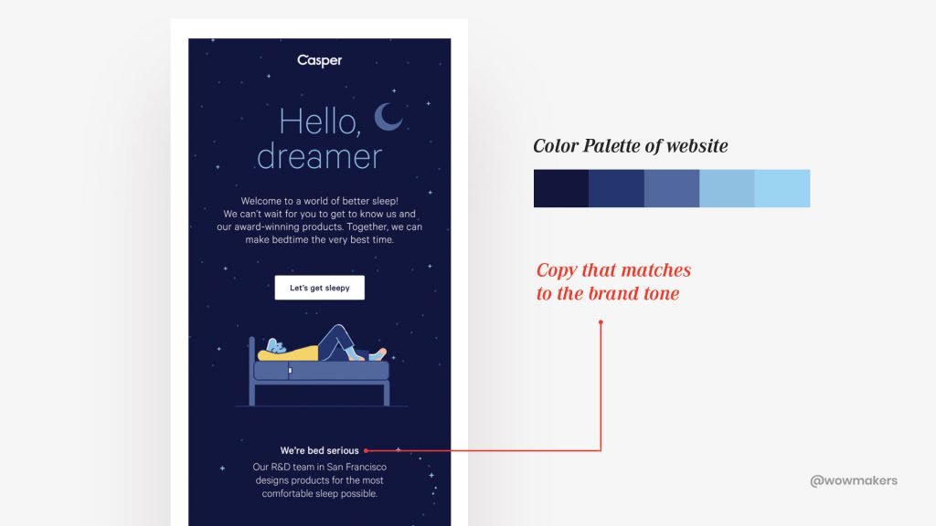
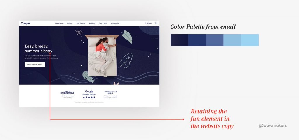
Casper’s email portrays a personable and friendly tone to it.
Meaning, it falls on the left side of the brand personality spectrum i.e the fun side.n side.
If you take a look at Casper’s website, you will see that this is the same brand tone they go for.
Tip #2 – Always Include Your Primary and Secondary Brand Colors in the Email Design
Staying true to the brand’s original colors will boost customer loyalty.
Here, Casper goes with the brand colors, making it easily relatable to the customer.
Standard Layouts – All That You Need to Know
Designing a standard layout makes the task of designing an email much easier.
How? It’s simple
You save time.
Tip #1 – Always Use a Layout with a Focus on CTA
If your email layout is designed and structured well, you can get the reader to move naturally towards your CTA (Call-to-Action) button.
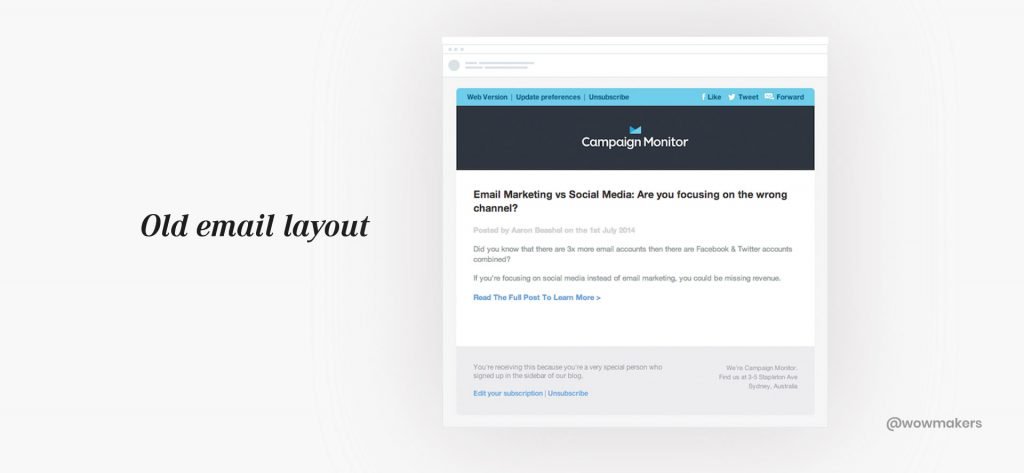
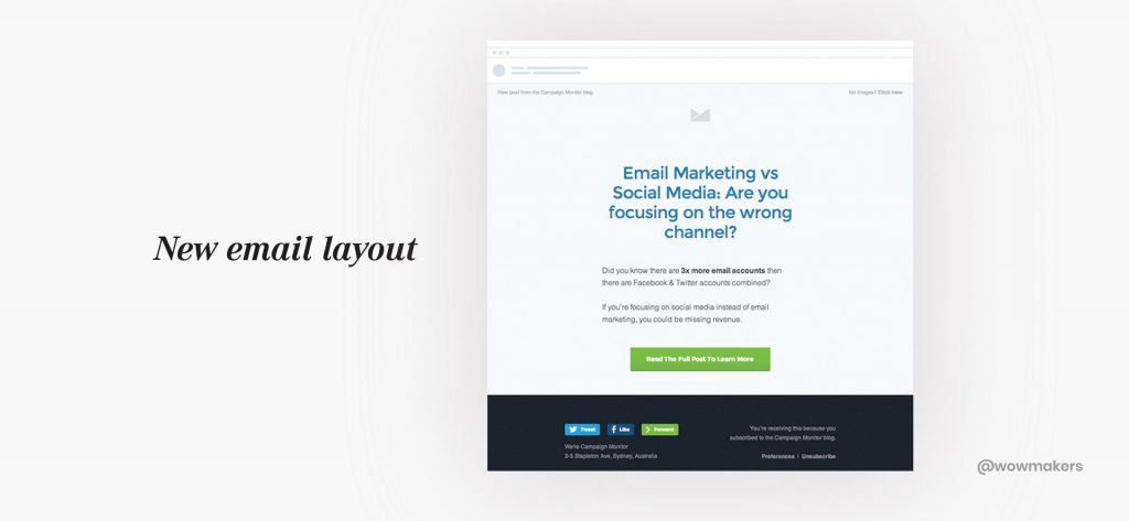
Here is an example of Campaign Monitor’s old and new email.
Next comes the new email that did wonders for the Campaign Monitor.
Their click-throughs increased by 127%.
Tip #2 – Avoid Frequent Changes in Layout
An email should come together and revolve around the image, product name and its call-to-action.
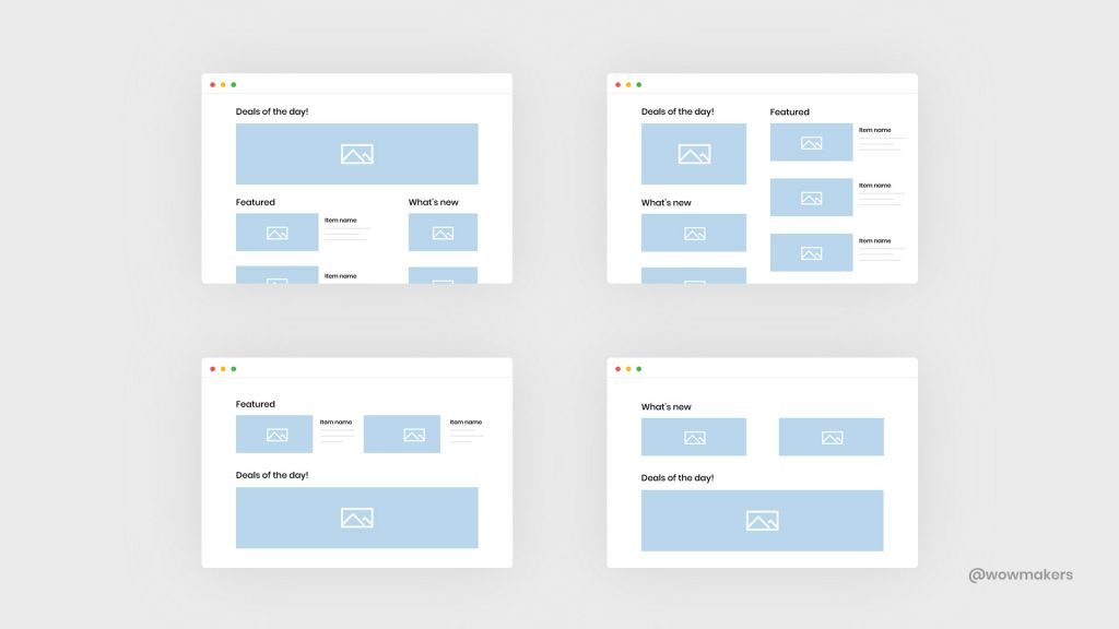
Changing the layout frequently might confuse your regular readers and they might even stop reading your emails altogether!
Always remember: people hate change.
CTA & Buttons – How to Tweak User Experience with Button Styles
Button styles that are well within the brand guidelines are a must.
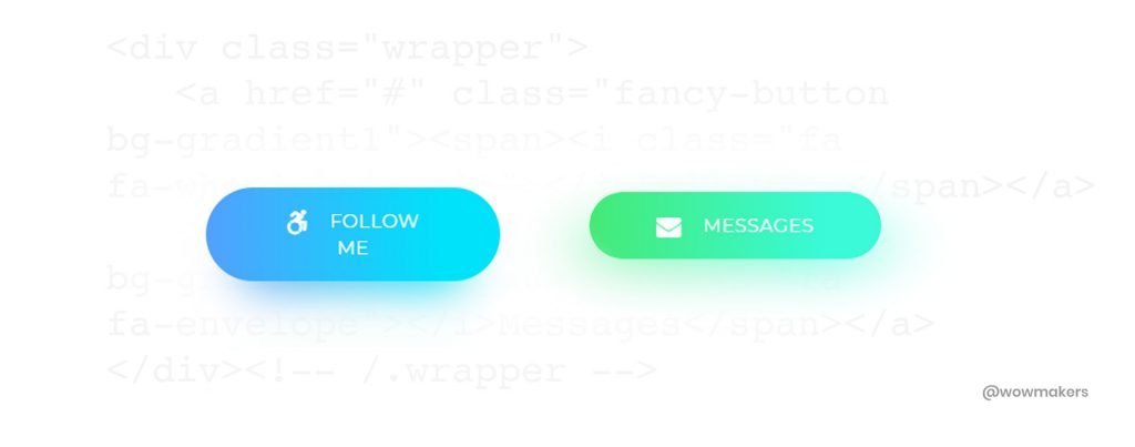
Bulletproof buttons allow building buttons with codes instead of images making the job easier.
You can explore the different kinds of button styles here.
Tip #1 – Use HTML Buttons
Most email clients don’t display images by default.
So if you use button image as your CTA, chances are they won’t see it at all.
You can eliminate this problem by using HTML buttons.
Creating button styles using HTML and CSS instead of using static images is the best way to bypass the design filters on email clients.
Tip #2 – Always Place the CTA to the Right of the Text and Stick to One CTA in an Email
A user always reads in an organized pattern from left to right.
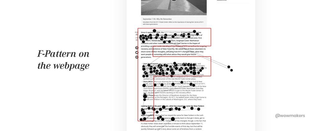
Nielsen Norman Group (leaders in user experience based research) in their research has revealed that most of the users follow an ‘F-shaped’ pattern.
They read the headline, and then they scroll down, skimming through the content.
On their way down, if they find anything interesting, they will read the subheading first, and then the intro part.
Here is an example of the ‘F-shaped reading pattern’ on the website of prominent TV Channel – History Channel.
This is how an ideal email layout should look like according to MailChimp
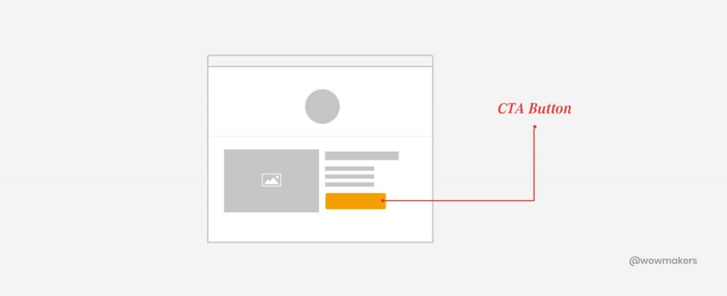
Also placing only one CTA will help an email to increase its click-through-rates.
Fonts – How Fonts Can Determine Brand Guidelines in an Email Design System
Choosing the right font has always been a question in demand.
A funky brand will look for a creative font while a traditional font would suit a serious brand.
All of this creates a framework for a brand’s email design.
Tip #1 – Choose the Right Body Font
Based on an article published in Bloomberg, it was reported that popular fonts like Arial and Helvetica may not be ideal for inbox reading.
Because some of the letters – like p, b, q, d – are too uniform, making them difficult to distinguish from each other.
So what are the recommended alternatives for Arial or Helvetica in email?
Georgia or Verdana.

A serif font will also make it easier to distinguish between letters.
Choosing the right text size will also do you a world of good.
Always set the body text size within the 14-16px range. 14px text is appropriate for longer emails and 16px for short ones.
Tip #2: Distinguish Headers with a Paired Font or Styling
Headers establish structure and make your messages easier to scan and quicker to comprehend.
There are many ideas to easily customize a header that improves an email’s readability:
Use the same body font but with larger font size (and/or with different color and styling, like bold or all caps)
- Using the same font for both the header and the body gives a sense of design simplicity and clarity.
The practice of including headers twice the size of body font will improve readability.
- Choose a font that’s different from the body text (and/or different color and styling, like bold or all caps)
The key here is to not choose two fonts with a lot of “personality” or unique characteristics that could conflict with each other.
For a brand choosing a serif font for the body text, a sans serif font for the header provides visual contrast.
The most popular principle for creating typeface combinations is to pair a sans serif header typeface with a serif body typeface.
You can check out the different types of fonts that you should pair for a good reading experience here.
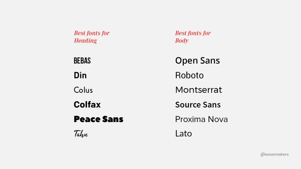
Font Pair is also a useful tool to check out the pairing of the different fonts.
How to Create a Design System with User Experience in Mind
A user’s need and perception changes over time.
Hence, we must remind ourselves to be empathetic about a user’s experience and think like a user.
This is where 3Ts of relevancy comes in.
3Ts of Relevancy:
TopicThe reader should feel that “This is what I was looking for.”TimingNow here the reader goes “Whoa, perfect, I was just looking for this.”TypeYour job is done when the reader thinks “Their emails are always nice and easy to read.”
Stay true to the 3Ts of Relevancy and a positive email marketing journey is on the cards!
Design Modules for Marketing Emails
Think of modules as the building blocks of the email world.
All these components could be assembled in different combinations to the needs of different users.
They are:
- Header module
- Action module
- Information module
Here are some examples of modules for you to be updated with.
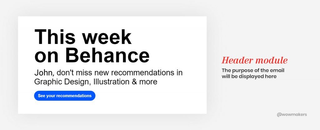
Header Module
What does a reader first see in your emails?
It could be a message that solves the reader’s problem, or a brand’s logo and its taglines.
Header module consists of all the elements that comes to the reader’s mind before anything else.
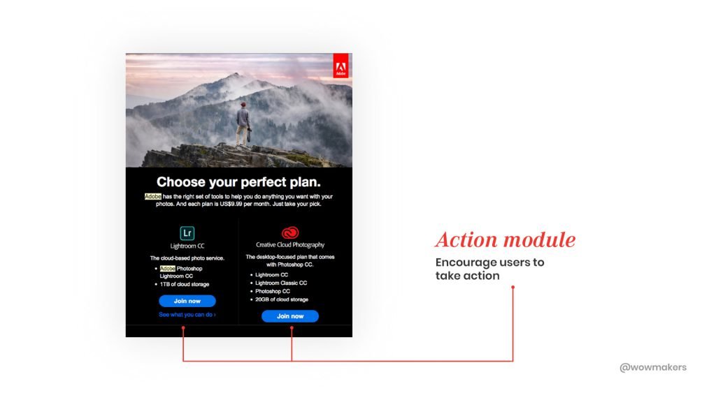
Action Module
Think of those action-oriented words that come attached to the emails.
These are emails that prompt users to take action.
For example, emails that contain call-to-action like, “offers”, “book meetings”, “read more”, “get directions” and “rate us now” come under the action module.
Information Module
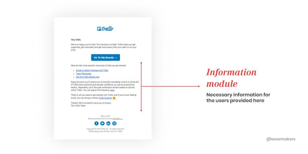
Those emails that serve as an aid to the user by offering information.
These are emails that prove to be a guide to the users.
The call-to-action here is different from the other modules.
For example, “faq”, “live support details”, “what to do next”, “working hours” and “resources” are some of the CTA’s that are commonly used in an email that follows information module.
You can learn more about the user-centered approach in email modules design here.
Best Practices for Better User Experience in Email Design
Catchy Headlines
“When you have written a headline you have spent 80 cents out of a dollar.”– David Ogilvy
Advertising genius, David Ogilvy’s wisdom knows no bounds.
We hear you, sir.
Headlines make or break an email.
This is the main reason why catchy headlines are an important factor in an email design system.
How to Write Amazing Headlines?
This is what you need to follow:
- Headlines should address a common problem to the user. It should be within 5-6 words.
- A sub-headline should always present the solution.
Solution-driven sub-headlines can get the attention of the user.
(Headlines talks about the problem and sub-headline talks about the solution)
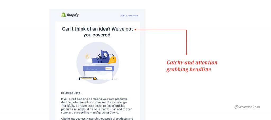
Here are some email headlines with a high conversion rate.
You can also check the quality of your email headlines using tools like:Free Subject Line Rating ToolCoschedule’s Headline Analyzer.Automizy Email SubjectLine Tester
Genuine Content
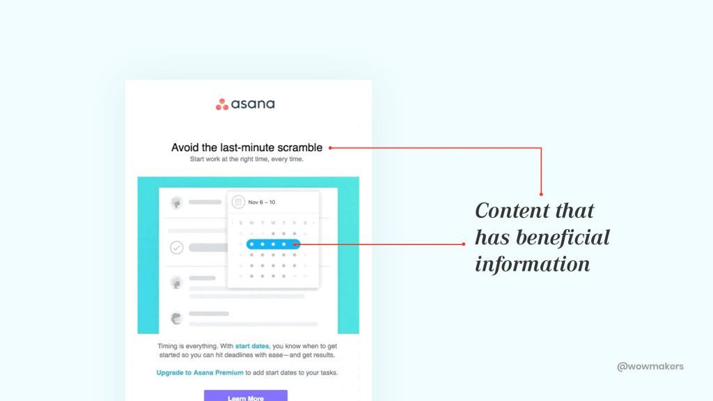
Emails work the best with genuine content.
How to make genuine email content?
By including useful, informative and beneficial information.
“Emails should try to build a rapport with the user at the very first glance.”
How though?
It should have an emotional promise made of two phrases that create a curiosity gap prompting the user to click.
Did you know that the average open rate of an email is 16.74%?
If your content promises to be clear and concise, your email has the potential to get a conversion rate as high as 17%.
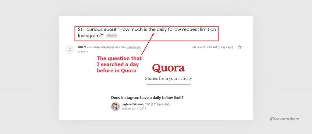
Personalization
What is personalization?
Tailoring a service according to the interest of a group or an individual based on their preferences forms the crux of personalization.
It can go a little pushy in mass emails, and they are quickly spotted these days.
How to personalize an email and offer a good experience?
Answer: Create an email that is extremely relevant, tailor-made and timely.
Proactive over Pushy Emails
My first strife with email marketing began over pushy emails.
It didn’t go down well, I managed to delete them and made an effort to never see such emails.
Naturally, emails of that stature became spam.
But a few days later, I received an email that was so subtle in its approach that it managed to get me to their website.
Now there was something different about what this particular company did.
Here are those two emails that pushed me and caressed me.
Pushy: Hey! Where have you been?! This is your final chance at our fantastic spring offer! If you want the offer, ACT NOW!
I know for a fact that I’m just one of the 1000 consumers they try to rope in.
Let’s take a look at the proactive mail.
Proactive: Hey! It’s been a while since we spoke last time, I thought this would be the perfect time to reconnect and let you know about our uber-cool offer.
Nice, right.
There’s no rush and I am absolutely at peace with this mail.
The scores just came in.
Proactive: 100, Pushy: 0.
The next time you think of emailing your customers, choose to be their friend.
Video Personalization
Video is a ton more engaging and most importantly, memorable.
Including video in your email can lead to a potential 200% – 300% increase in click-through-rates.
Personalization has come a long way!
From welcome emails, invitation, offer emails and more, with video personalization you can add a personal touch.
Some of the major video personalization tools are:
1. Vidyard – GoVideo
Vidyard is the next-generation video platform aimed at driving more revenue with more user engagement.
Their services pan across video hosting, analytics, content personalization, and live streaming.
Brands can create unique video content with Vidyard’s personalized video solutions.
Vidyard GoVideo, one of the tools of Vidyard, allow users to record and share personal video messages and track engagement for these messages.
Here is a video on how Vidyard – GoVideo works.
2. Wistia
A major player in video hosting for business, Wistia does a pretty good job in video personalization but what makes them stand out is its accurate in-depth analytics.
Check out their explainer video, so cool you want to subscribe to them.
CTA Driven Design
Your business and your emails, in the end, depending on one major element.
Call-to-action.
CTA can be anything. (Next gen CTA, on video, live chat)
There should be a definite CTA hierarchy that helps you differentiate from your primary CTAs, secondary CTAs, and tertiary CTAs.
The usage of contrasting colors, directional cues, and big-sized buttons always make it easy for the customer to find it quickly.
Did you know that personalized call-to-actions perform 202% better than basic CTAs?
Let us explore some of the examples that are redefining CTA on the go.
1. Loom Pro
Loom is the go-to screen recording tool for your phone as well as your computer.
Their latest offering, Loom Pro explores the concept of collaborating with your peers and colleagues in a much more efficient manner.
Loom Pro now comes with HD recording, video call-to-action, drawing tool, viewer insights and more.
Check out their explainer video which showcases their features.
2. Later
Later is a popular social media platform and Instagram scheduler.
They engage in email marketing and by the look of it, they do a really good job.
Their emails are the best examples to showcase how CTAs should be placed.
Check out Later’s effective use of the call-to-action button in an email.
Use of GIF in Email
Today’s email marketers use wit and humor as a means to emotionally connect with their audience.
How?
With animated GIFs.
Here are some examples of the use of GIFs in the email:
1. Nike
What a brilliant way to showcase the unique selling proposition of the product.
Kudos to Nike on the excellent use of GIFs in an email!
2. Adidas
Adidas brought back the iconic gazelle designs, which was favored by celebrities like Michael Jackson and Kate Moss.
What better way than a GIF to show a tint of the gazelle collection.
Responsive Design
The majority of people access emails from their phones.
This number is on a constant rise.
According to MailChimp, you could reach 15% more potential users if you change your methods and styling of your mobile-focused communication.
This is why you need to implement responsive design in your email design system.
Here is an example of responsive design.
With a responsive design, the email takes on a form suitable for any device.
Remember the golden Bruce Lee saying about water.
“Remember, my friend, be like water.
When you are poured into a cup. you become the cup, when you are poured into a teapot, you become the teapot.”
Responsive design is just like water.
How to make Responsive Email Design like a pro?
- Stick to an email layout that is compatible with all the devices.
- Use 13 or 14 pt for body fonts and nothing less than 20 pt for titles.
- Place the CTA button where it is readily visible. The audience should never have to scroll for it.
- Test your email before sending to customers. Always check how the audience views your email. You can use services like Litmus or Email on Acid.
Trends in Email UX Design (2021)
1. Drift Video (Powered by Conversational Marketing)
Drift is making huge strides in the world of conversational marketing.
Flooding the inbox with emails are bad for user experiences.
This is where Drift comes in handy:
Drift allows you to embed a video in an email (with a GIF thumbnail of the video).
When the reader clicks the GIF, she gets redirected to an external web page where a chat window awaits her.
At this point of time, the marketer gets notified about the reader, and they can have a chat with the reader.
Voila, real-time conversation!
And the result?
Less funnel-time and increased sales velocity because engaging with customers is happening in real-time.
Using Drift Video in email can help you have a conversation with your prospective leads.
Here’s a video showing it works.

2. AMP for Emails – the Latest Innovation in Email Marketing
Google has come up with AMP for Emails that turn static emails into dynamic ones.
The reader can now :
View live updates of stock prices, weather updates, personalized offers from an app-like functionality within an email.
Let’s take a look at how OYO rooms implemented AMP for emails.
Thanks to AMP, a reader can purchase a product within the email itself without ever needing to access the product website.
This is how it allows its recipients to interact dynamically with the content directly in the message, promising an interactive customer experience that is consistent and scalable.
With increased inmail capability, personalization, and security,
Check out this video on AMP:
3. Usabilla for Email
Usabilla takes on the idea of being customer-centric to the heart.
It is the perfect tool out there to make sure emails are sending the right messages.
With Usabilla, an email marketer can effectively optimize emails with the help of right customer feedback.
One can design a customized widget screen, create a feedback form and ask the questions that are needed to ask.
On top of that, it offers a detailed, intuitive analysis that gives complete optimization.
Here is an explainer video of Usabilla.
https://www.youtube.com/watch?v=EfxjZzyjDdk
Conclusion
Before anything else, a big Thank You!
You have come a really, really long way.
I hope you had some useful takeaways from this article that you could include in your email marketing strategies.
In this guide you have successfully learned:
- UX principles for email marketing.
- Design system for email marketing.
- Design modules for email marketing.
- Best practices for better UX in email marketing.
- Rising UX trends for email marketing in 2021.
With this new learning, you will now be able to tackle the problems of emails going down the drain due to spam filters, low open rates and click-through-rates and the idea of email personalization and segmentation.
What UX principle did you lack in your email design?
What are the changes that you are going to implement in your design system? I would love to hear your stories!
If you have any honest feedback about this guide, do get in touch with us!
I’m all ears!


