UX Designers, Product Managers, and other key stakeholders in an organization spend quite a lot of time on many research methods to understand the habits, behavior, and needs of their end-users.
With the help of keen observation and multiple studies, it’s been found that there are many usage patterns that every consumer goes through consciously or not while using any product whether digital or physical.
Based on this understanding, UX designers and enthusiasts have been referring to a set of user experience laws formulated by scientists and UX pioneers. The purpose of this article is to introduce and educate people about some of these ‘laws’ of UX Design.

Create unforgettable user experiences
Talk to a UX Expert!
21 Laws for Great UX Design
Prefer a quick reference? Download the free one-page 21 UX Laws Cheat-Sheet (PDF) — then read on for how to apply each one in real product work.
#1) Law of Aesthetics
People tend to believe that things that look good will work better.
Researchers from the Hitachi Design Center first studied this effect in 1995. They found a strong correlation between aesthetic appeal and ease of use.
They concluded that users are strongly influenced by the aesthetics of a product.
This meant that users perceived attractive products to be more useful.
In other words, the more positive the response is to visual design, the more tolerant they are of minor usability issues.
So in the end, people do judge a book by its cover.
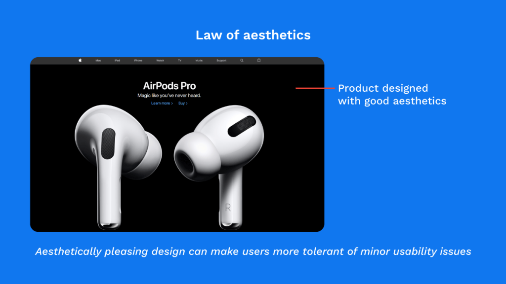
How to use Aesthetic Usability Effect
Make your Interface appealing. Design with people’s interaction model in mind. Focus on the high-friction, high-value points in your user funnel (top landing pages, bottom-of-the-funnel stages such as checkout flow).Improve your aesthetics with continuous user feedback. Don’t change usability when applying the aesthetic-usability effect, which means the core function of the product should be intact.
#2) Fitts’s Law
You may or may not have heard about Fitts Law, but it’s a fundamentally important one that’s most frequently ignored.
In 1954, Psychologist Paul Fitts, while examining the human motor system, discovered that the longer the distance to a target, and the smaller the target’s size, the longer it takes to acquire that target.
The time to acquire a target is a function of the distance to and size of the target.
This law applies primarily to buttons, where the purpose is to find and select.
This is why the more important keys on a keyboard like Space, Enter and Shift are often larger than the rest of the keys.
Or why the brake pedal is bigger than the accelerator pedal because you want the driver to access the brake pedal much more easily.
It also explains the reason why the off button on certain machines is big so that you can shut the machine off easily in the case of an emergency, and why the on button is small so that you accidentally don’t turn it on.
This law is applicable wherever visual interactions take place, i.e. when humans interact with modern computer interfaces.


Take a look at our portfolio
Applications of Fitts law in Desktop and Mobile experiences
There are many elements and areas to consider while designing UI elements.
Be it the size and distance, corners, edges, and menus, chances are a user can accidentally hit the wrong button at any given time.
This is why you see the Windows Start menu and Apple menu in the corners of your screen.
If you think about it, pop-up menus are dreaded for a reason. They are right in your face, reducing travel time by creating smaller movements.
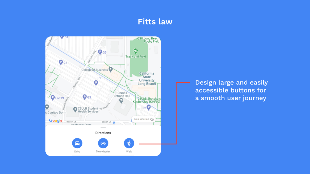
You can see Google Maps using Fitts law to make the user journey simple and effective.
How to use Fitts law in UI designing? With Menus, drop-drowns, or any type of interactive list, shorter is smarter. Buttons to complete an action should be closely beside the active elements. Important actions should be larger so they are easier to select.
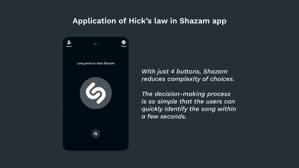
#3) Hick’s Law
UI and UX designers have a big hand in the emotional state of their users.
Nobody wants to create interfaces, apps, and websites that are frustrating.
Designers, thus rely on Hick’s law to enhance the user experience journey.
In simple words, Hicks’s law is a simple idea that says the time it takes to make a decision increases with the number and complexity of choices.
You can see Hick’s law at work in the navigation of websites.
If you think about it, the law is omnipresent and we can most definitely see its influence in the number of switches on a console, washing machine, or remote.
Good UX requires that you find out the functionalities that will answer the user needs, and guide them to functions they need at the moment.
If users end up in the decision-making dilemma of what next, they become frustrated and might leave that website or app altogether.
Not long ago, Twitter displayed a lot of choices on its homepage.
The new design reduces decision points and exhibits greater focus.
How to use Hick’s law? If your payment process is long and complex, break it down and prompt users to register their email and create a password. Use the card-sorting method to build categories and labels. Use images properly. Taking away images will make the design unusable. Apply Hick’s law when designing Control displayDrop down menusContact pagesSign up formsButton selectionNavigation menus
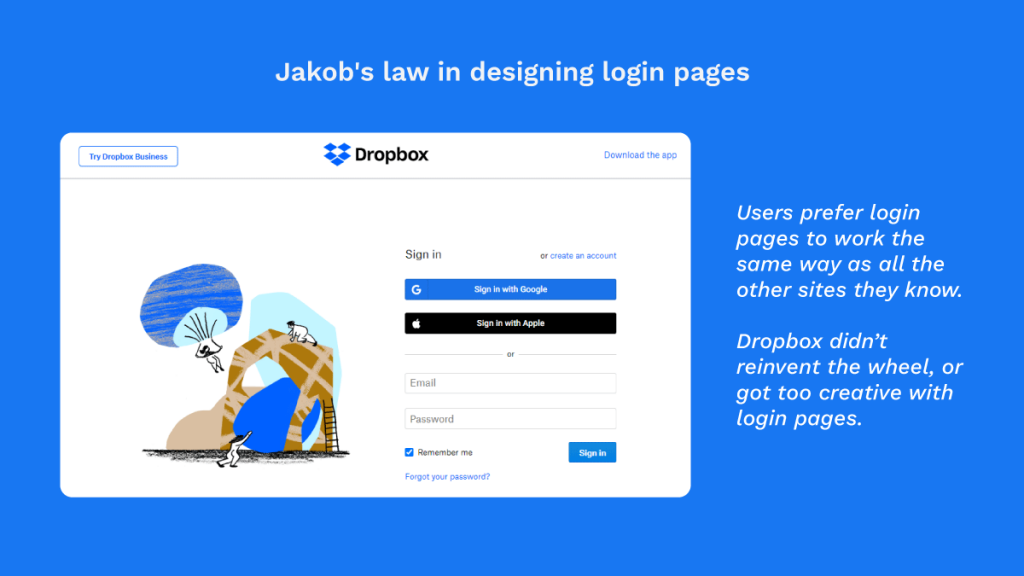
#4) Jakob’s Law
According to this law, a user will transfer expectations that are built around one familiar product to another that appears similar.
For instance, users prefer an app, product, or website to work the same way as all the other sites they already know.
Jakob’s law recommends using familiar patterns in design, to facilitate a better user experience.
It means that sometimes your urge to create something entirely unique and fancy might hamper the user experience simply because the user is unfamiliar with it.
The law was coined by Jakob Nielsen, director of Nielsen Norman group that he co-founded with Dr. Donald A Norman, Apple’s Vice-President of Research.
Any e-commerce website would also be a practical case of this law.
Information about the best deals, names of products and their price, the purchase option, and shopping cart.
If you are ever going to set up e-commerce, the smartest option is to follow the structure of a similar e-commerce site.
For instance, think about the positioning of a shopping cart on these sites. There is a reason why they are at the end (Z Pattern is at work here) and it is being tediously followed across all other similar platforms.
Think about the last ten websites you visited. Pretty sure that the majority of them had the company logo on the top left corner and if you click it, it will direct you to the homepage.
This is one of the most common sights on a website, and users always expect it to work the same way on Facebook, Amazon, YouTube, and your website too.
How to use Jakob’s law? Strictly adhere to the visual hierarchy of reading patterns. Tone down the individual appearances and distinct design of your app or a site in all ways: Visual designTerminology and labelingInteraction design and workflowInformation architectureSimplify the learning process by providing similar design patterns.
Gestalt Theory
Gestalt theory was developed by German psychologists in the 1920s.
It was hypothesized that people tend to organize visual elements into groups or unified wholes when certain principles are applied.
Sound knowledge of these principles can help to effectively choose which design elements should be chosen in each situation, how to influence visual perception, and users’ behavior, and create usable design elements.
Whilst there are several principles that Gestalt theory defines, the main ones are:
#5) Law of Simplicity
This law states that people will perceive and interpret ambiguous or complex images in their simplest form possible.
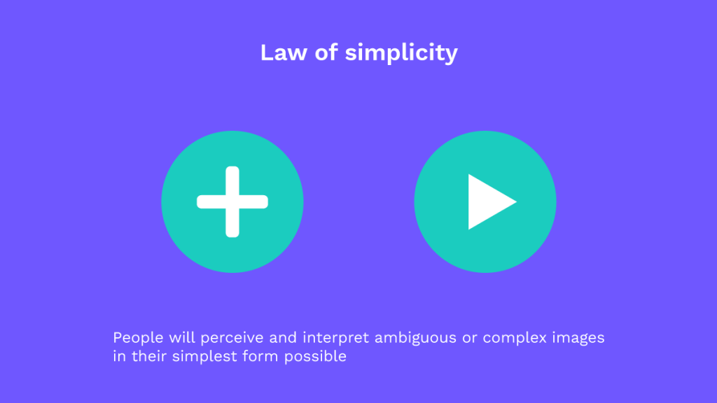
According to many studies, the human eye tends to find order and simplicity in complex situations feeding their need to prevent their mind from information overload.
Because people are drawn to perceive something that requires less mental effort.
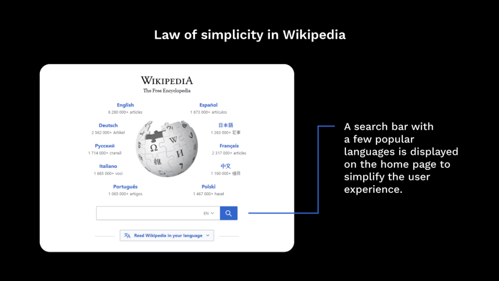
How to use the Law of Simplicity? The law of simplicity can be used when wireframing a website.
Try wireframing a new concept and placing it along with the current version. The eyes do not lie, and they will definitely pick out the variances and quickly provide material for iterations. Always minimize the number of elements in a design. Use designs that are symmetrical in nature in your UI prototype. This will help to grab the users’ attention.
#6) Law of Proximity
According to the law of proximity, objects that are near each other or proximate, tend to be put together/grouped.
Proximity overrides the similarity of color, shape, and other factors that might differentiate a group.
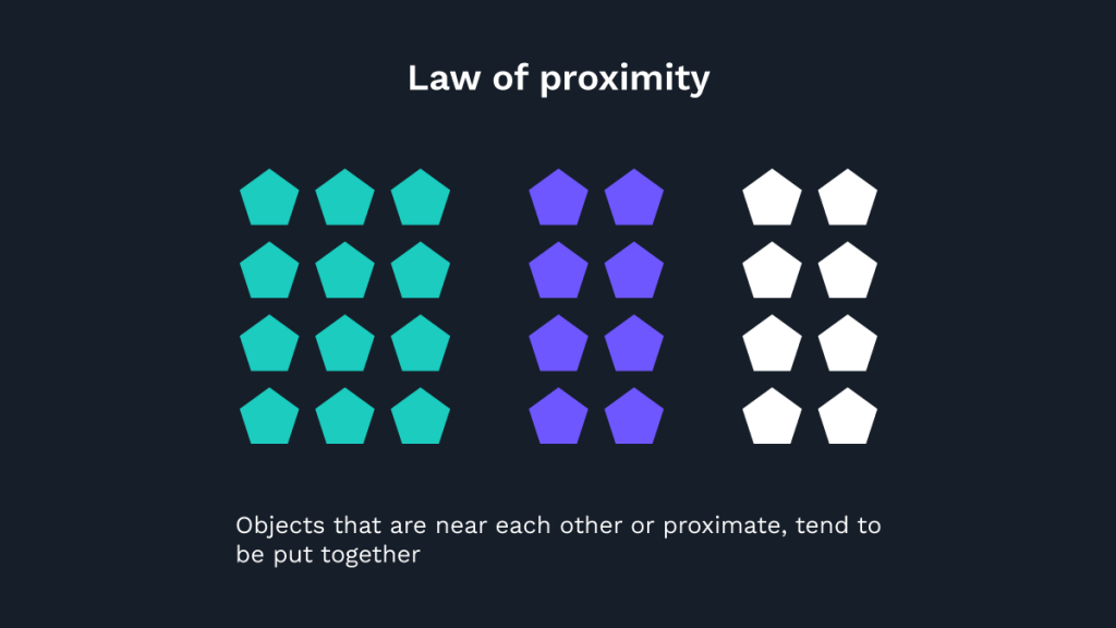
It allows users to glance at a group of content in one go.
A prime example of this would be Spotify.
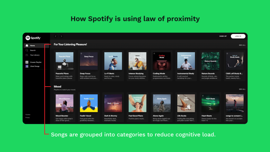
Despite the feeling of a bundle of information, it is clear where each group is.
Here, popular playlists are separated from the type of playlists that match your mood.
The nearness of each image and its corresponding text communicates to its users that they are related to each other.
This is how Spotify uses this law to distinguish between Today’s Top Hits, All out 10s and more.
Job well done, Spotify.
How to use the law of proximity? Always bring elements that belong to a common group, closer together. Distinguish between the images, headlines, descriptions, and other information for each of its stories with the use of black/white spaces. This is to show that these elements are unrelated.
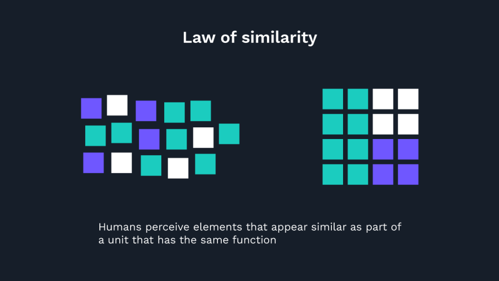
#7) Law of Similarity
The law says humans perceive elements that appear similar as part of a unit that has the same function.
This similarity can refer to any number of features like color, orientation, size, and motion, which means that this grouping can occur in visual and auditory stimuli.
For example, Bing uses the law of similarity to group its search accessibility buttons.
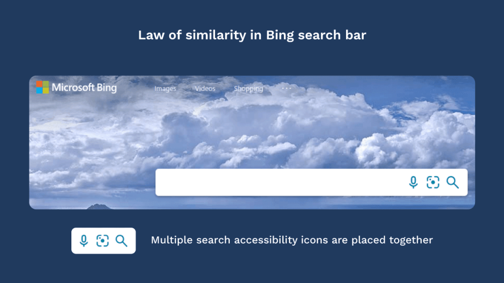
One can instantly tell that the links that are purple in color were previously visited by the user.
This means that when objects are similar, another object can be emphasized by creating an anomaly if it is different to the others.
How to use the law of similarity? Always design elements of the same color, feature, and function in a similar style as the user will recognize an identical element and its function. To create an anomaly, break the design or text pattern, for elements that exhibit different functions.
#8) Law of Closure
Our brains tend to fill in the information and avoid contradictions as much as possible.
This is because people possess the innate nature to try and see the whole picture.
And we are so good at it that we understand the bigger picture even if the picture is missing, say a lot.
This means that users tend to look for a single, recognizable pattern in a complex arrangement of visual elements.
This lays the foundation for the law of closure where elements are grouped if they seem to complete some entity.
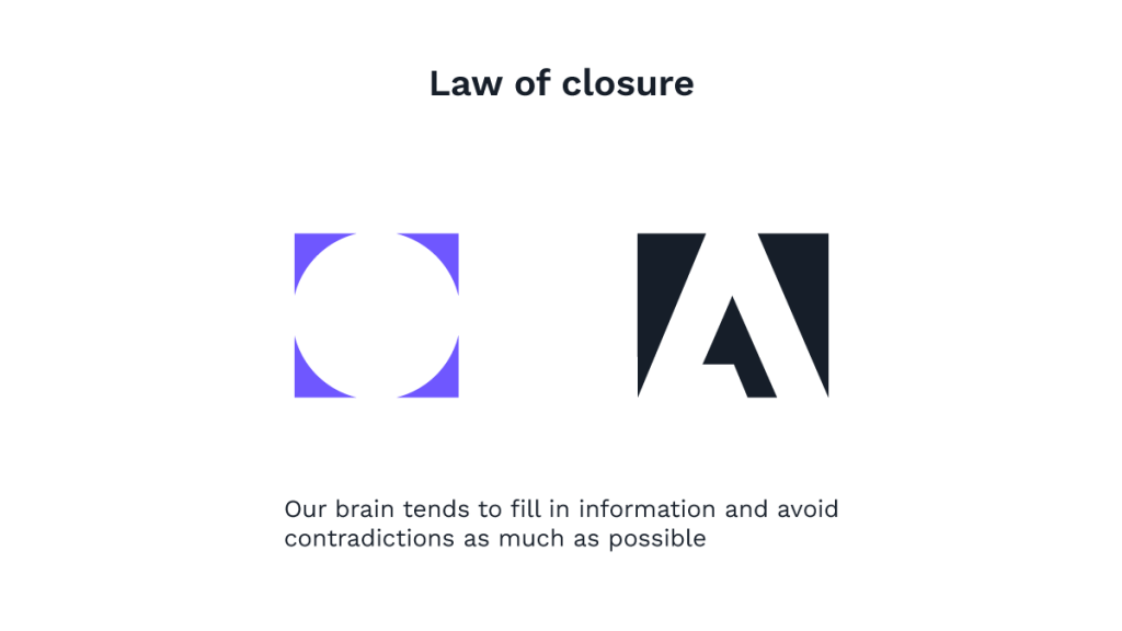
If you think about it, some of the world-famous logos that you’ll definitely see without fail everyday borrow the law of closure.
And as you can see in the examples above, this law is majorly used in logo design, and our brains can easily recognize the panda, rabbit, and peacock even though there are empty spaces all around.
How to use the law of closure? Decrease the number of elements, you need to let the user understand and what you aim to show. This makes it easier to design icons, pictures, and brand logos that are simple. Play with positive and negative spaces and allow room for the cognitive ability of the user to kick in.Always provide enough information to complete the pattern.
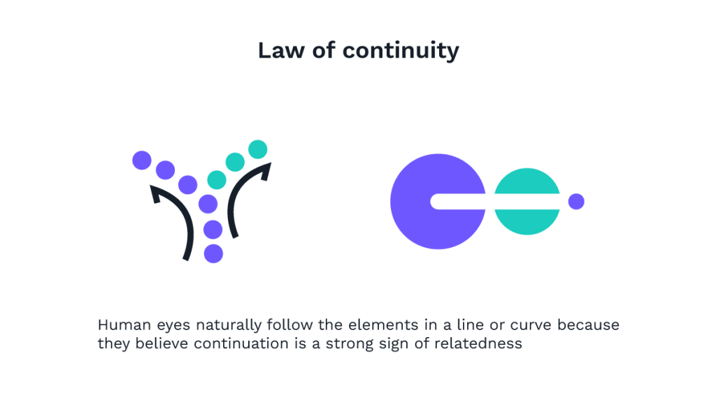
#9) Law of Continuity
Do you want your users to have a smooth interaction with the website? Paying attention to this law is the quickest way to attain that.
This law states that human eyes naturally follow the elements in a line or curve because they believe continuation is a strong sign of relatedness.
Here, we perceive lines as a part of continuous movement.
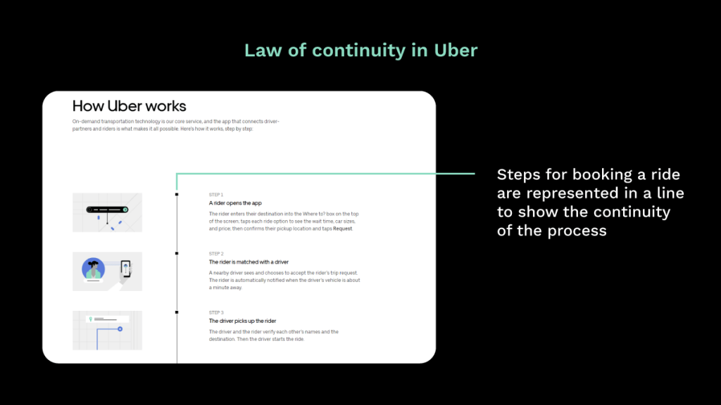
Uber uses the law of continuity to communicate each step to the user and how it paves the way for the next step.
How to use the Law of Continuity? Place elements in a way that the user can easily identify the elements that are in a group. Add extra visual cues only when it is necessary. Guiding the user through different segments and content can do its charm when the user is looking for a quick route through the website.
#10) Law of Focal Point
This is kind of like arriving in a Lamborghini on a highway of old cars.
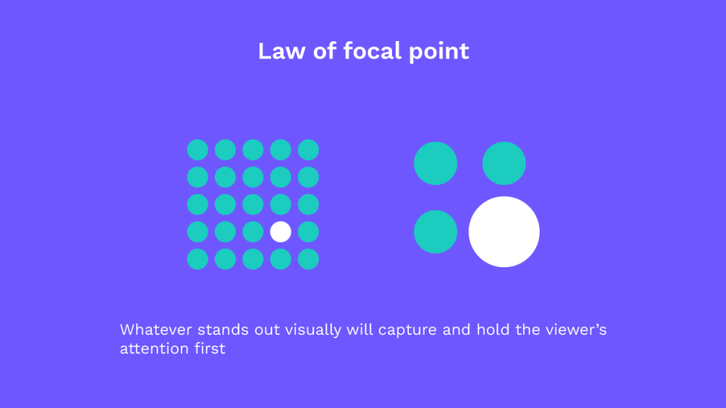
Needless to say, the Lambo will be the center of attention as it visually captures the viewer’s attention.
This is what the law of focal point is also about.
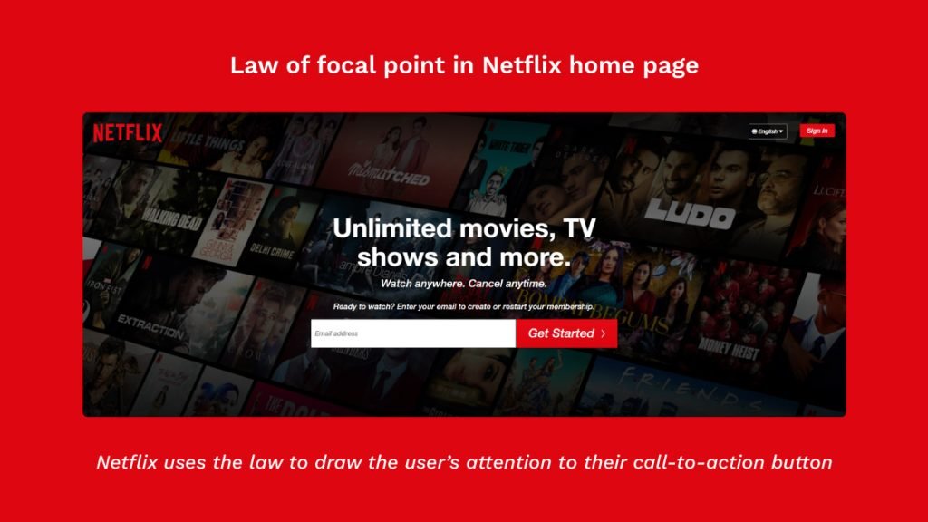
How to use the law of focal point? Contrast is a good way to create focal points as it calls for attention for being different. More dominant elements will attract the human eye and get noticed first. Make the elements or focal points dominant by giving them more weight by choosing a different color or by increasing the size of such an element.
#11) Miller’s Law
This law can put your memory to the test.
Not a joke, according to this law, in the user’s mind (or 'in users' minds').
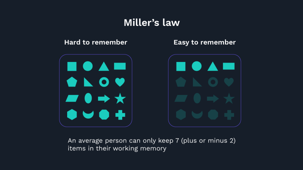
The rule/law goes like this, the average person can only keep 7 items (plus or minus 2) in their memory at one point in time.
Mobile notifications are created to work in the user’s working memory, so the listed icons will be less than 7.
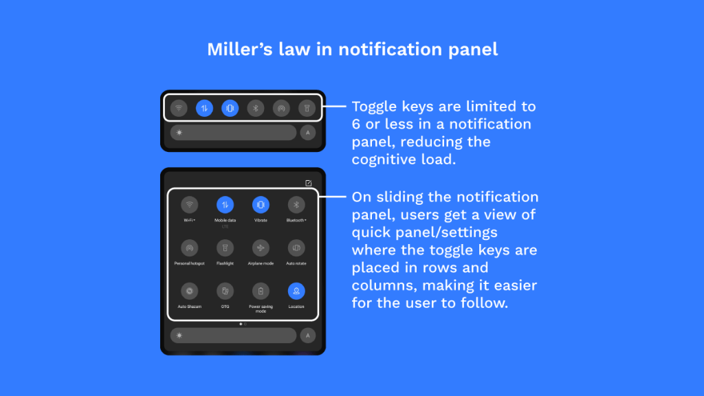
As you can see from the example above, Miller’s law is effective in grouping information and the user can read it within a quick amount of time.
How to use Miller’s Law? Always present content in a manageable way by putting them in a group. Chunking is an effective method of presenting them in groups. Try to organize content in groups of 5-9. Get rid of options that a user finds useless. Create a clear visual hierarchy with headings and subheadings. Short paragraphs containing 2-3 sentences should always be separated by white space.
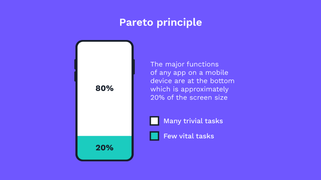
#12) Pareto Principle (80/20 rule)
Named after the revered economist Vilfredo Pareto, the Pareto principle defines that 80% of the consequences occur from 20% of the causes.
Also known as the 80/20 rule, this principle was derived from the imbalance of land ownership in Italy and it is used to illustrate that things are never equal and the minority often owns the majority.
The formula for the Pareto principle goes like this:
Always focus on X% of the user tasks used by Y% of the users at Z% of the time.
In a perfect world, every feature would be important, every employee would contribute the same at work, and every bug would be equally important.
However, according to this rule, most situations have an unequal distribution.
For example, out of 5 great ideas, 1 idea may be truly great and inspiring. This idea will result in a majority of the impact for the group.
This is why you have to realize that the majority of results come from a minority of inputs.
If 20% of bugs contribute to 80% of errors, focus on fixing these bugs first.
If 20% of customers contribute 80% of revenue, you should focus on satisfying these customers.
If 20% of workers contribute to 80% of results, try and reward these employees.
How to use the Pareto principle? Make decisions that involve allocating time, effort, and resources based on the 80/20 variable. By using this variable you can figure out where the imbalance exists.[ X% of the user tasks used by Y% of the users at Z% of the time. ]Focus attention on the elements related to the top 20% of the tasks used by 90% of users for 80% of the time.
#13) Peak-End Rule
Created by the Nobel Prize-winning Israeli psychologist Daniel Kahneman, the peak-end rule is based on our recollection of events rather than the experience as a whole.
Don’t you remember the good old days of havoc when the final season of Game of Thrones aired and everyone was infuriated with how the show turned out?
It didn’t matter if the show kept everyone’s favorite character alive or not, or if it did justice to character arcs.
What really mattered was how it had ended!
Even the most loyal fans came out with spikes with total disregard for the show as a whole, giving us the finest example to date, of Peak-End rule.
This psychological rule tells us that people are more likely to draw judgment based on the experience they felt at its peak and its end rather than the whole journey or the experience of it.
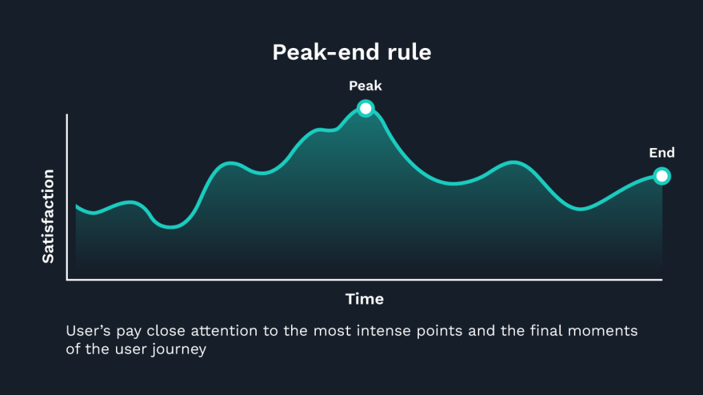
The onus here is to create moments of convenience and comfort that creates pleasant and positive experiences.
It may be a small change in an icon, a bright color or a lively illustration at the end of a successful interaction that can establish an everlasting experience with the user.
It’s also important to keep in mind the impact of negative peaks, as people remember negative experiences more vividly than positive ones.
Hence, designers and UX advocates must avoid moments of confusion and frustration that can act as a negative peak.
How to use the Peak-End rule? When designing experiences and interfaces, pay close attention to the most intense points of a user journey (the peaks) and the final moments (the end). Use customer journey map/story mapping to design the best climax (peak) into user experiences. Create emotional payoffs in the journey of a user. Identify the moments when your product is most helpful and bank on that to make those moments even better. Use lively illustrations and bright colors at the end of successful processes to transform a pleasant experience into a truly memorable one.
#14) Tesler’s Law
About time simplicity got overrated!
You heard that right, this law right here is not much of a fan of simple things.
You must be scratching your head right now because Tesler’s law straight-up contradicts what the rest of the UX laws dwell on.
However, on close inspection, we understand Mr. Larry Tesler, the creator of the law, does present a valid point.
The law is also known as 'conservation of complexity' states that in any system, there’s a certain amount of complexity that cannot be reduced.
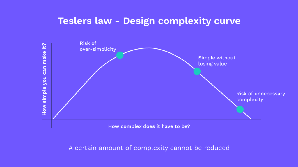
We know that the job of a UX designer is to simplify processes and make them faster, but we have to realize that there are things that cannot be simplified to a more basic idea.
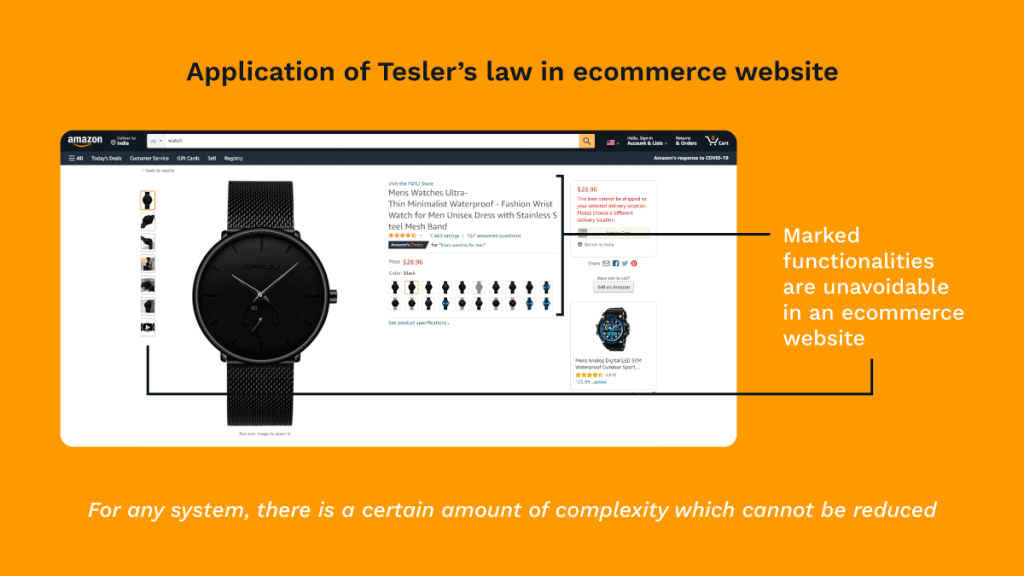
As much as we want shopping to beat the time, to purchase a product, there are still much data to go through.
Without this data, the process, however, cannot be completed.
How to use Tesler’s Law? The goal should be to reduce functionality without messing with the website design leaving no room for a significant penalty. Try to incorporate custom preferences so that some decisions are easily relatable with the user. Reduce the number of distracting elements by showing the necessary options to complete a task.
#15) Von Restorff Effect
Also known as the ‘isolation effect’, this law anticipates that when multiple similar objects are present, people will likely remember the one that differs from the rest.
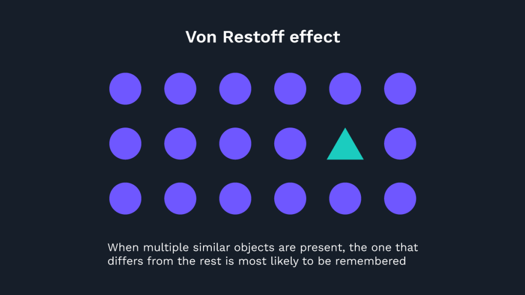
Coined by German psychologist, Hedwig Von Restorff, her work relates to Gestalt principles.
Sharing similarities with the law of focal point, this law too takes brownie points for being the main reason why all call-to-action buttons look different from the rest of the action buttons on the website.
The law is mostly found in use, in pricing pages of products, where most of the pricing packages are the same other than a few variations in the text.
Companies use this to their advantage by highlighting their preferred pricing in a different color, shape, and size to bring focus onto that item.
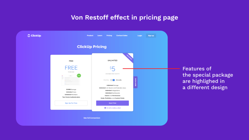
ClickUp uses the Von Restorff principle in their pricing plan, by highlighting their preferred plan’s name and price.
A darker shade in the pricing box isolates the chosen plan making it the anchor point of the user’s attention.
How to use the Von Restorff effect? Make important info or key actions visually distinctive. Use words like “special offer” and “new” for the product listings to stand out. Seek out opportunities in the interface to learn how you can create positive experiences. Maintain a balance. If you end up making too many different colors and shapes, users can easily get distracted by the noise.
#16) Zeigarnik Effect
Remember the time when an episode of your favorite show ends in a cliffhanger, leaving you in suspense?
Chances are you won’t rest and you will move on to the next episode.
Don’t you think this happens a lot in our daily lives as well?!
Discovered by Soviet psychologist Bluma Wulfovna Zeigarnik in the 1920s, Zeigarnik Effect suggests that an incomplete task creates mental stress which keeps it in the front of our memory.
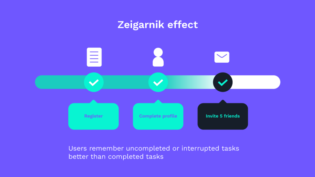
This means that people remember interrupted or uncompleted tasks better than completed tasks.
We can apply this concept to UX, where we could talk about new features and offer it for an X amount and tell the user if he wants to proceed, he must do Y action like register, buy, etc.
LinkedIn would be the best visual example of this effect.
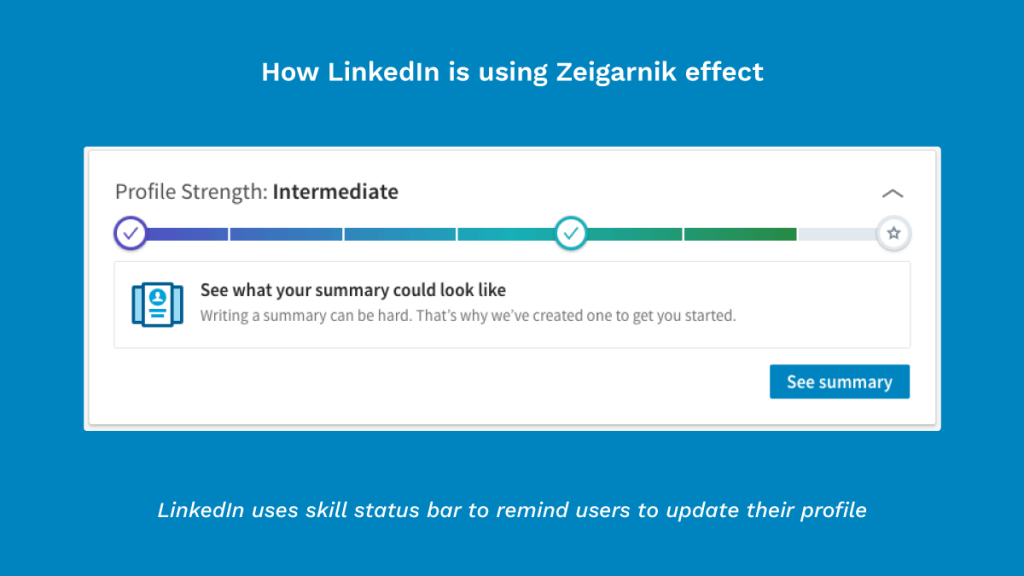
When users see a message like “add skills to showcase your strength”, they are more likely to provide the missing information.
Well played, LinkedIn!
Check out how Instagram puts this effect to great use with its infinite scroll.
Even when you know for sure you have nothing more to see in your feed, Instagram draws its card – ‘infinite scroll’ to tempt you into continuing using the app.
It banks on the need/possibility of seeing a new story.
How to use the Zeigarnik Effect? Gamify user interactions and introduce progress trackers to motivate users to complete the task. Take advantage of the user’s state of mind once they’ve completed a task. Now, that is a perfect moment to focus on a user’s new goals! Break down content into chunks of effective information. Don’t disclose everything you have right at the beginning. Give users a clear idea that they can scroll for more content.
#17) Doherty Threshold
The Doherty Threshold says productivity climbs when a person and a system respond to each other fast enough that neither is left waiting. The benchmark, set by Walter Doherty and Arvind Thadani in 1982, is 400 milliseconds. Stay under it and the interaction feels immediate, attention holds, and people stay in flow. Cross it and the same task starts to feel sluggish, even when nothing is technically broken.
In product design this is less about raw engineering speed and more about perceived speed. When something genuinely takes time to load or process, give the interface a way to acknowledge the wait: optimistic UI that updates before the server confirms, skeleton screens that hint at the shape of what is coming, progress indicators that show motion. A well-placed loading animation can make a two-second wait feel shorter than a blank second of nothing. The goal is to keep the conversation between person and system feeling continuous.
#18) Goal-Gradient Effect
First described by psychologist Clark Hull in 1932, the Goal-Gradient Effect is the tendency to speed up as we get closer to a goal. The finish line pulls harder than the start. People who feel almost done are far more likely to push through than people who feel they have barely begun, even when the work remaining is identical.
Use it to carry people through multi-step flows like onboarding, checkout, or profile setup. Show progress clearly with step counters or progress bars so the end stays visible. A small head start helps too: a loyalty card that arrives with two of ten stamps already filled feels closer to a reward than an empty one, so people engage more. Break long tasks into visible milestones and let each completed step do the motivating.
#19) Postel's Law (Law of Robustness)
Postel's Law, named after internet pioneer Jon Postel, advises designers to be liberal in what you accept and conservative in what you send. It started as a networking principle and travels well into product design: build interfaces that tolerate messy, varied, human input, while keeping what the system gives back clear and consistent.
People type phone numbers with spaces, dashes, and country codes in every combination imaginable. A robust form accepts all of them and quietly normalises the result rather than rejecting input on a technicality. Plan for the range of ways people will reach your product, including different devices, abilities, and contexts, and translate their intent into what the system needs. Pair that flexibility with clear, predictable feedback so people always know their input landed.
#20) Parkinson's Law
Coined by Cyril Northcote Parkinson in a 1955 essay, Parkinson's Law observes that any task will inflate to fill the time available for it. Give a job an hour and it takes an hour; give it a day and it somehow takes a day. In product terms, a task expands to match whatever effort the interface seems to ask for.
The design lever is to shrink the time and effort a task actually needs, then beat the expectation. Autofill, smart defaults, saved details, and one-tap actions all cut the work a person has to do. When checkout finishes faster than someone braced for, satisfaction goes up. Set honest expectations about how long something will take, then quietly deliver it sooner.
#21) Occam's Razor
Attributed to the medieval philosopher William of Ockham, Occam's Razor holds that among options that solve a problem equally well, the simplest one wins. For designers it is a discipline of subtraction: keep what directly helps someone complete their task, and cut what does not.
Apply it by treating simplicity as a default rather than a cleanup pass at the end. Question every element on a screen and ask whether the experience would suffer without it. If it would not, remove it. The aim is a design that is finished not when there is nothing left to add, but when there is nothing left to take away that the user still needs.
Want all 21 laws in one place? Download the free 21 UX Laws Cheat-Sheet (PDF) to keep on your desk or share with your team.
UX Laws in the Age of AI (2026)
These laws were written long before chat assistants and predictive interfaces became everyday tools, yet they describe how people behave, not how technology works, so they hold up well as AI moves into the products we design. If anything, AI raises the stakes on getting them right.
The Doherty Threshold matters more than ever when a model needs a few seconds to think. People will not wait at a blank screen, so streaming responses token by token, showing a typing or thinking state, and using skeleton states keep the interaction feeling alive while the work happens. Hick's Law reframes one of AI's real strengths: instead of presenting every option, a good assistant narrows the field with smart defaults and a short set of relevant suggestions, which lowers the choice load that overwhelms people. Jakob's Law explains why the now-familiar chat layout, with a message thread and an input box at the bottom, has become a convention worth respecting. People arrive already knowing how to use it because they have used something similar elsewhere, so fighting that pattern costs you more than it gains.
Tesler's Law is a useful reminder that complexity does not vanish when AI enters the picture, it moves. The model can absorb a great deal of it on the person's behalf, turning a vague request into a structured action, but someone still has to decide which complexity is safe to hide and which a person needs to see and confirm. The Aesthetic-Usability Effect takes on a new weight too, because a clean, considered interface shapes how much people trust the answers an AI gives them. Polish alone cannot make an output correct, so the craft is in pairing a calm, legible surface with honest signals about confidence and sources. AI amplifies what these laws have always taught. Human judgment still leads on where to apply them.
Where these laws come from
The canonical collection of these principles is Laws of UX, created and maintained by designer Jon Yablonski. It is the reference we and most of the industry return to, and it is well worth bookmarking for the deeper write-ups, citations, and original research behind each law. We have credited it here because good reference content should point to its sources.
Putting these laws into practice
See how we design UX
Till the next time…
It’s important to understand that most of the time, your eyes and ears fail to carry what you can perceive.
Keeping this in mind, designers must think about perception and imagination and try to get them linked with the help of UX laws.
So how did you feel learning all of the laws?
Feel free to add your comments and share your side of the story.
Do get in touch with us and let us know how UX laws are making your lives better.
Till next time, your friendly neighborhood UX studio 😊.
FAQs
#1) What are UX laws?
UX laws refer to a set of guidelines that have been proven to enhance the user experience.
They are based on user behavior and psychology research and are meant to provide designers with a framework to create interfaces that are intuitive, usable, and enjoyable.
#2) Why are UX laws important in design?
UX laws are important in design because they provide designers with a foundation for creating user-centric solutions that address the needs of their users. By adhering to UX laws, designers can ensure that their interfaces are intuitive and easy to use, which ultimately leads to better engagement and satisfaction from users.
#3) How can I apply UX laws in my design?
Applying UX laws to your design is a matter of understanding how user behavior and psychology principles can be applied to the interface you are creating. This involves researching user needs, preferences, and motivations as well as utilizing usability testing to ensure that the design meets the requirements of users. Additionally, it can be helpful to consult with other UX professionals to get an understanding of industry standards and principles. By applying these principles to your design, you can create a user experience that meets the needs of its users while providing them with an enjoyable and intuitive experience.
#3) How can I use UX laws in my design process?
UX laws can be used in the design process by considering them during the ideation and prototyping phases. By understanding and applying these principles, you can create interfaces that are more intuitive, easier to use, and provide a better user experience.
It is important to keep in mind that UX laws are not strict rules, but rather guidelines that can be adapted to meet the needs of your specific users and context.
#4) Are UX laws applicable to all types of interfaces?
UX laws can be applied to all types of interfaces, including websites, mobile apps, software applications, and even physical products. The principles behind UX laws are based on human behavior and psychology, which are universal across different contexts and mediums.
#5) What is the serial position effect? Why does the serial position effect occur?
The serial position effect refers to the tendency for people to remember items at the beginning and end of a list more than items in the middle. This phenomenon occurs due to how our brain processes information, with short-term memory being more active in the early stages of learning and long-term memory taking over in later stages. Therefore, when presented with a list of items, we naturally remember the first few more easily than those in the middle. This phenomenon is commonly used in UX design to help users remember important information or features more easily. By placing key features at the beginning and end of a list, designers can ensure that users are more likely to recall them after navigating away from the page.
This principle of using the serial position effect in UX design can be applied to a variety of scenarios. For example, when designing product pages for e-commerce sites, it is important to place the most relevant information at the beginning and end of the page. This ensures that shoppers are more likely to remember information such as discounts or product availability.
#6) What distinguishes design principles from UX laws?
Design principles are flexible guidelines used by designers to create user-centered designs, while UX laws are based on research and observation of user behavior and are more universal in their applicability. Designers can use both principles and laws to create effective designs.
#7) What is the 80% rule in UX?
The 80% rule is a concept in UX design that states that users’ attention should be focused on the top 20% of content, features, and functions that are most used by customers. This helps designers prioritize the areas of their designs that will offer the most value to the user. The other 80% can then be used to enhance usability.
#8) What are the 6 stages of UX?
This actually comes under UX Design Process and it has been explained in one of our latest blogs.
#9) What are the 5 dimensions of UX?
The five dimensions of UX are:
1. Usability – how easy it is for users to complete tasks;
2. Accessibility – making sure everyone can use the user experience;
3. Credibility – building trust between user and product;
4. Desirability – appealing visuals and enjoyable experiences;
5. Brand alignment – making sure the UX expresses and reinforces the brand’s identity.
#10) How many UX laws are there?
There is no single fixed number, since UX laws are drawn from psychology, design research, and human behaviour rather than a closed rulebook. The widely cited Laws of UX collection by Jon Yablonski lists around 20 to 30 principles and grows over time. In this guide we cover 21 of the most practical and frequently referenced laws, each with a plain explanation and how to apply it in real product work.