

Branding / HyperDynamics
A hidden H inside an infinity sign: brand identity for HyperDynamics, a smart-city technology platform
Industry
Smart City & Campus Technology
Services
Brand Identity · Guidelines · Explainer Video


1symbol, two ideas: an H and infinity
9colours: 3 primary, 6 secondary
4layout formats from one shape system
50pages of brand guidelines
HyperDynamics builds smart, efficient and sustainable environments for cities, campuses and institutions. Its AI-driven platform pulls separate systems into one central view, with real-time data, security and day-to-day operations in the same place.
It needed an identity that city and campus operators would trust, with enough energy to read as new technology. The identity answers with one mark for one platform that joins many systems.
- Brand
- HyperDynamics
- Industry
- Smart-city and smart-campus technology (AI and IoT platform)
- Audience
- City authorities, campus operators and institutions
- Service
- Brand identity design and a 2D explainer video
- Deliverables
- Logo, symbol and construction grid; colour and type system; layout system; app and social icons; stationery; imagery direction; 50-page brand guidelines; 2D animated explainer film
- Year
- 2024 (identity), 2025 (explainer film)
- Language
- English
The mark
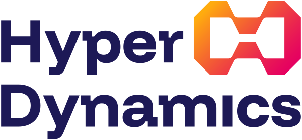
An infinity sign, with an H in the space between
The symbol carries two ideas in one shape. Its outline is an infinity sign: systems that keep running together, with no seam where one ends and the next begins. Inside it, the negative space forms an H for the name.
That is the platform's job, drawn as a mark. HyperDynamics takes the separate systems a city or campus already runs and makes them work as one.
The wordmark sits in two lines beside the symbol. Where space is short, on app icons, social profiles and favicons, the symbol stands alone.


Colour and type
Dark Royal Blue for trust, magenta and amber for momentum
We gave the brand the Ruler archetype: authority, order and stability, the things a city expects from the platform that runs its systems. Dark Royal Blue carries that.
Bright Magenta and Bright Amber carry the other half, energy and progress. They meet as a gradient across the symbol. Six secondary colours are reserved for illustration and data visualisation.
Funnel Display is the primary typeface. Aileron, a neo-grotesque, is the secondary.


The system
One symbol, cut into a kit of layout shapes
A platform brand produces a lot of layouts: social posts, event screens, sales decks, posters. So the symbol was taken apart. Its cut corners, bridges and openings became a kit of shapes that crop photos and hold headlines.
The guidelines show the kit working at 9:16, 1:1, 2:3 and 3:2. A designer who never met us can pick a shape and stay on brand.


At scale
One identity. Infinite possibilities.
In the presentation, the idea goes up on a billboard. Four panels, four glass versions of the symbol, and the whole identity read as one line: one identity, infinite possibilities.
It is a mockup, built to test the mark at the scale a city brand will meet. The symbol works as an object as well as a logo, which is why the 3D renders were part of the delivery.


Applications
Built for cities, campuses and the screens in between
The symbol's outline becomes a window that frames the places HyperDynamics works in. All shown here as presentation mockups.


Stationery and team wear
Print that takes its corners from the symbol
The business card takes the symbol's cut corners as its own shape. The guidelines give the print specifications: an 87 × 55 mm card on 338 gsm matte stock, a 225 × 110 mm envelope and an A4 letterhead.


The explainer film
The platform, explained in two and a half minutes
In 2025 we followed the identity with a 2D animated explainer film for HyperDynamics. It opens on a city's traffic jams, flooded streets and overflowing bins, then an isometric map wires offices, rail, factories and power into one hub. Next it names three parts of the platform (Hyper Sync, Hyper Orchestrator and HyperVisualizer) and ends on the HyperDynamics logo.
What it means for you
A platform brand that other people can build with


01
One idea, drawn once


02
A kit, not a folder of files


03
Tested at scale before print
What does a brand identity project for a technology platform include?
How do you design a logo for a platform that connects many systems?
We start from what the platform does for the people who buy it, then look for one shape that says it. HyperDynamics joins a city's or a campus's separate systems into one platform. The mark is an infinity sign, for systems that keep running together, with an H hidden in its negative space for the name.
Will our own team and other agencies be able to use the brand guidelines?
That is what they are for. The HyperDynamics guidelines give clear space and minimum sizes (70 px on screen, 1.2 inches in print), the logo don'ts, every colour in web, RGB and CMYK values, layouts for 9:16, 1:1, 2:3 and 3:2 formats, and print specifications for the stationery.
Are the billboards and signs on this page real installations?
No. They are mockups from the identity presentation. We put a new identity on billboards, building signs, screens and print before anything is produced, so the client can judge it at real scale and we can see where a rule is needed.
Do you design brand identities for IoT, AI and enterprise technology companies?
For the record
HyperDynamics brand identity: the facts
WowMakers designed the brand identity for HyperDynamics, a smart-city and smart-campus technology platform that brings the separate systems of cities, campuses and institutions into one AI-driven, central platform. The identity, presented in December 2024, rests on one symbol: an infinity sign with an H hidden in its negative space. It includes the logo and construction grid, 3D renders of the symbol, a colour system led by Dark Royal Blue, Bright Magenta and Bright Amber, Funnel Display and Aileron typography, a layout system of shapes cut from the symbol, app and social icons, stationery, imagery direction and 50 pages of brand guidelines. In 2025 WowMakers also made a 2D animated explainer film for HyperDynamics, shown on this page. The billboards, signs and screens shown on this page are presentation mockups. WowMakers is a strategic design partner, designing since 2011.
Work with us
Building a platform brand that has to work in a boardroom and on a billboard?
We start with what your platform does for the people who buy it. The mark, the system and the guidelines are built on that one decision.
See our branding services and portfolio, or the rest of our case studies.


